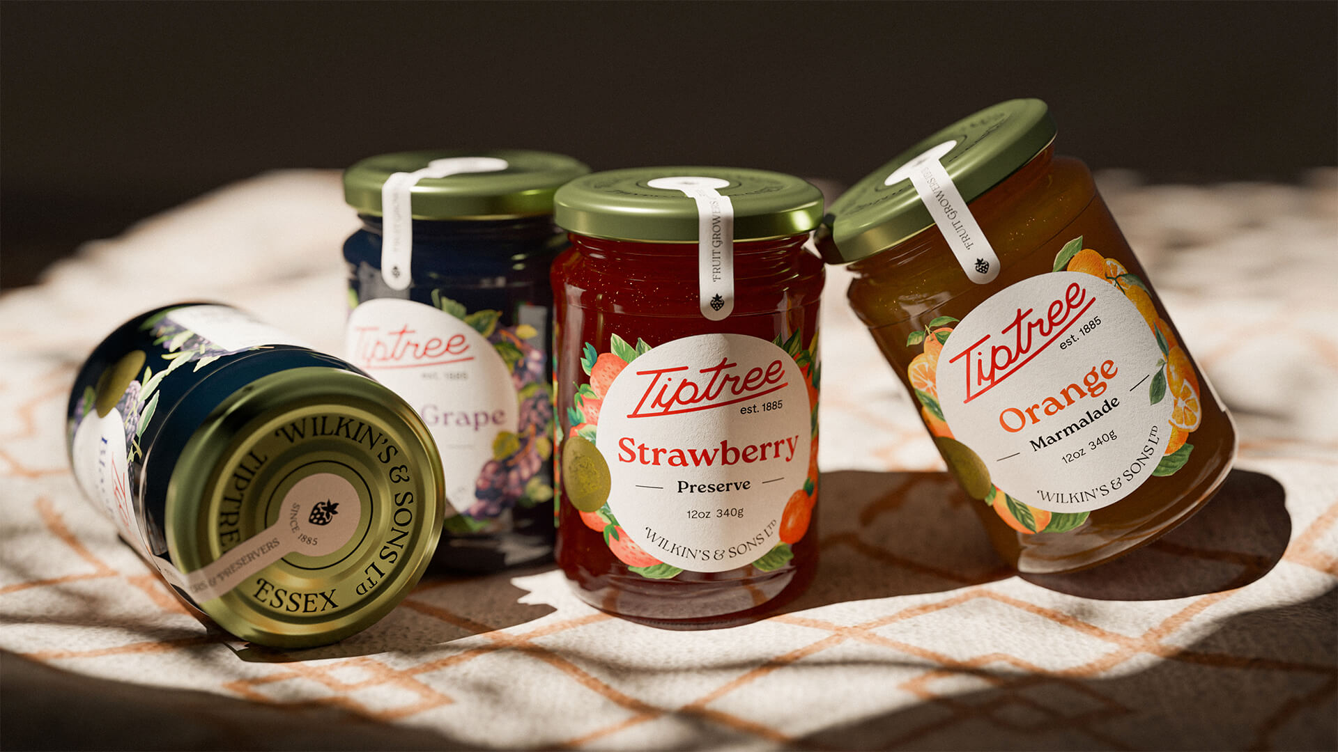
Tiptree Redesign
Identity, packaging, and experience design
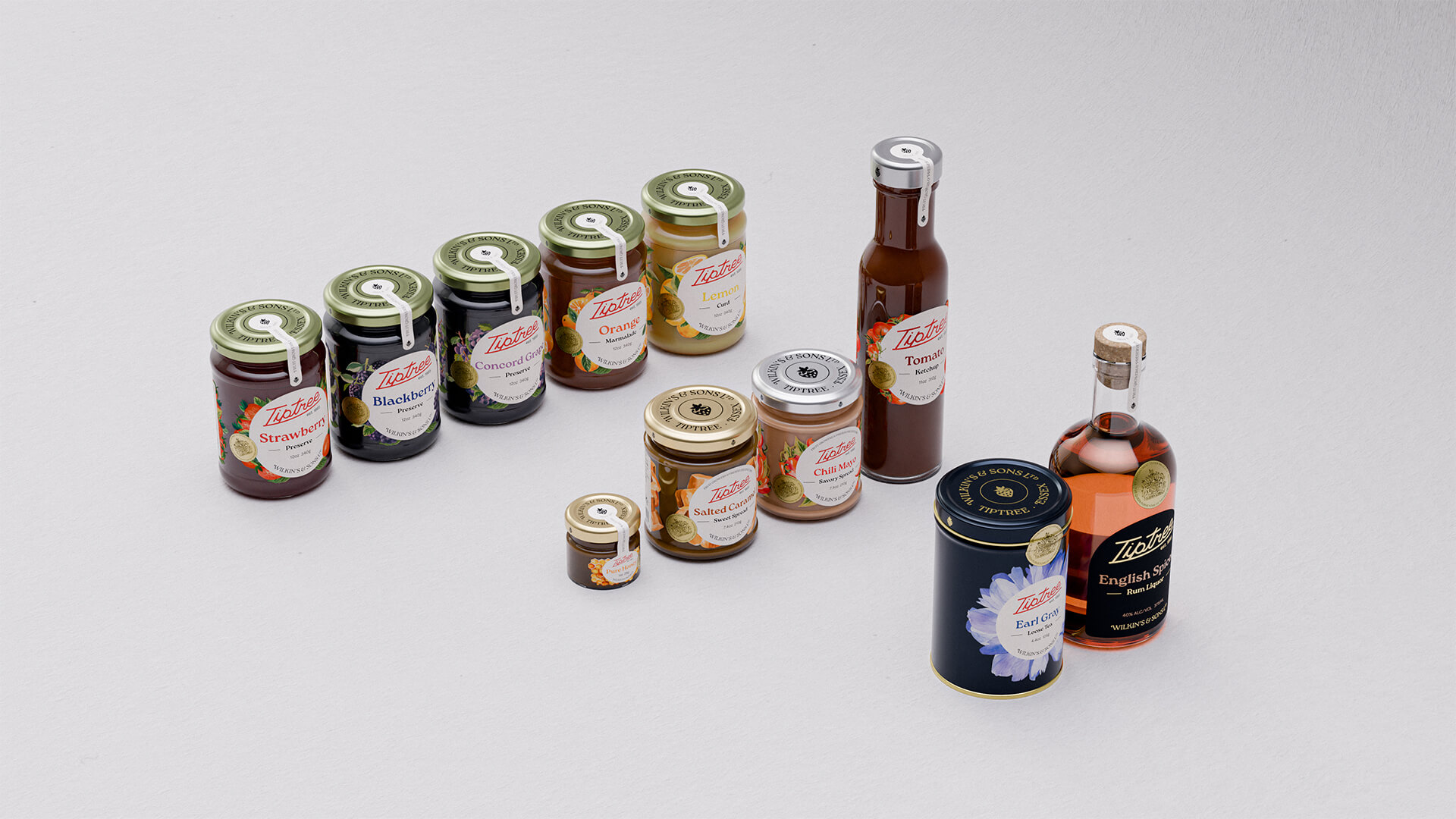
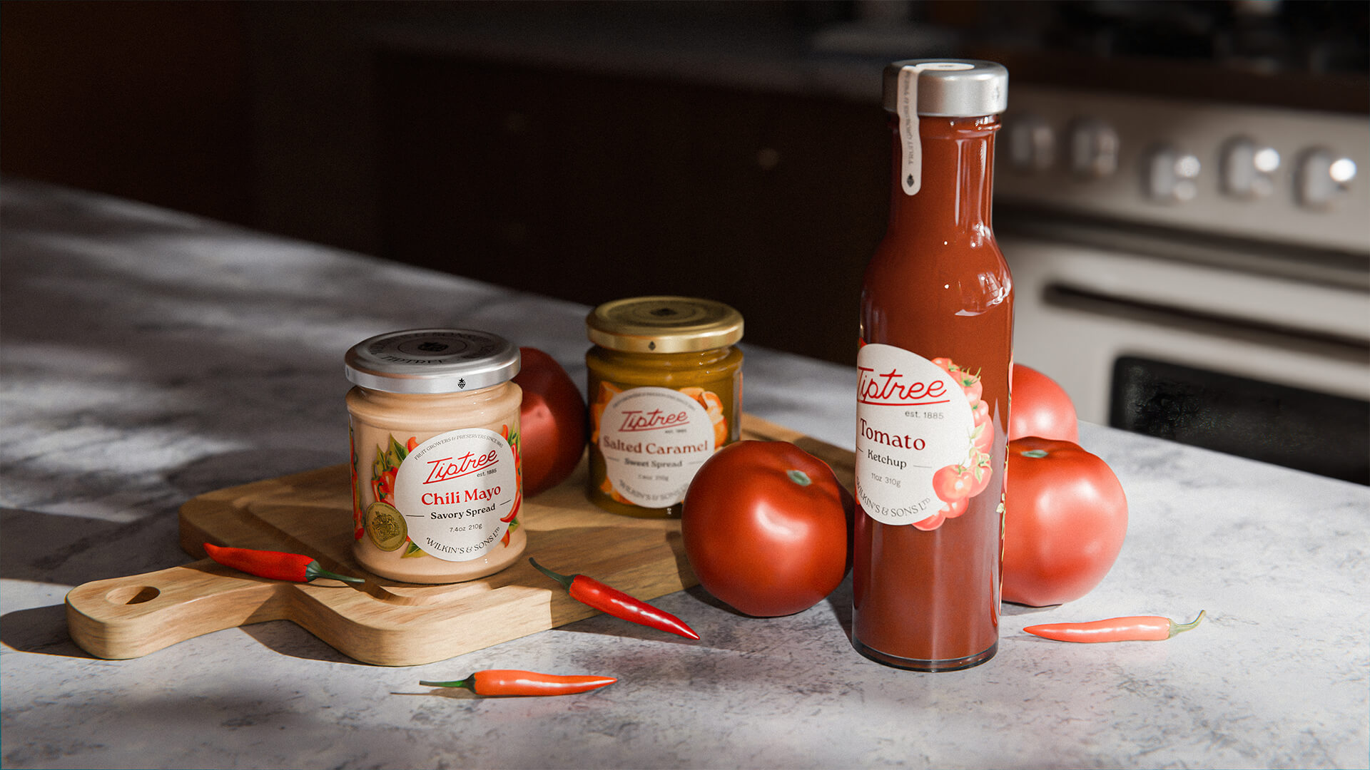
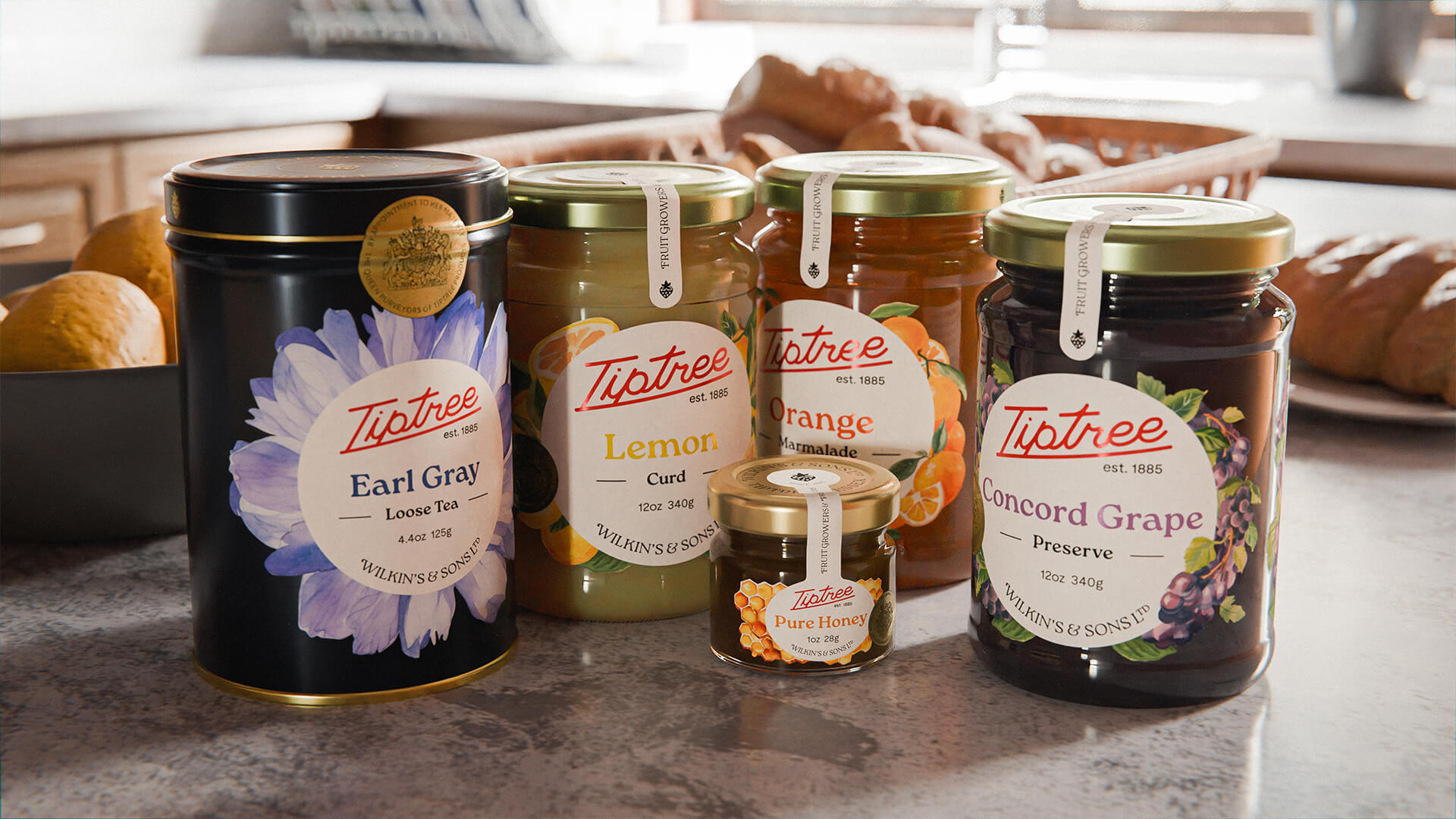
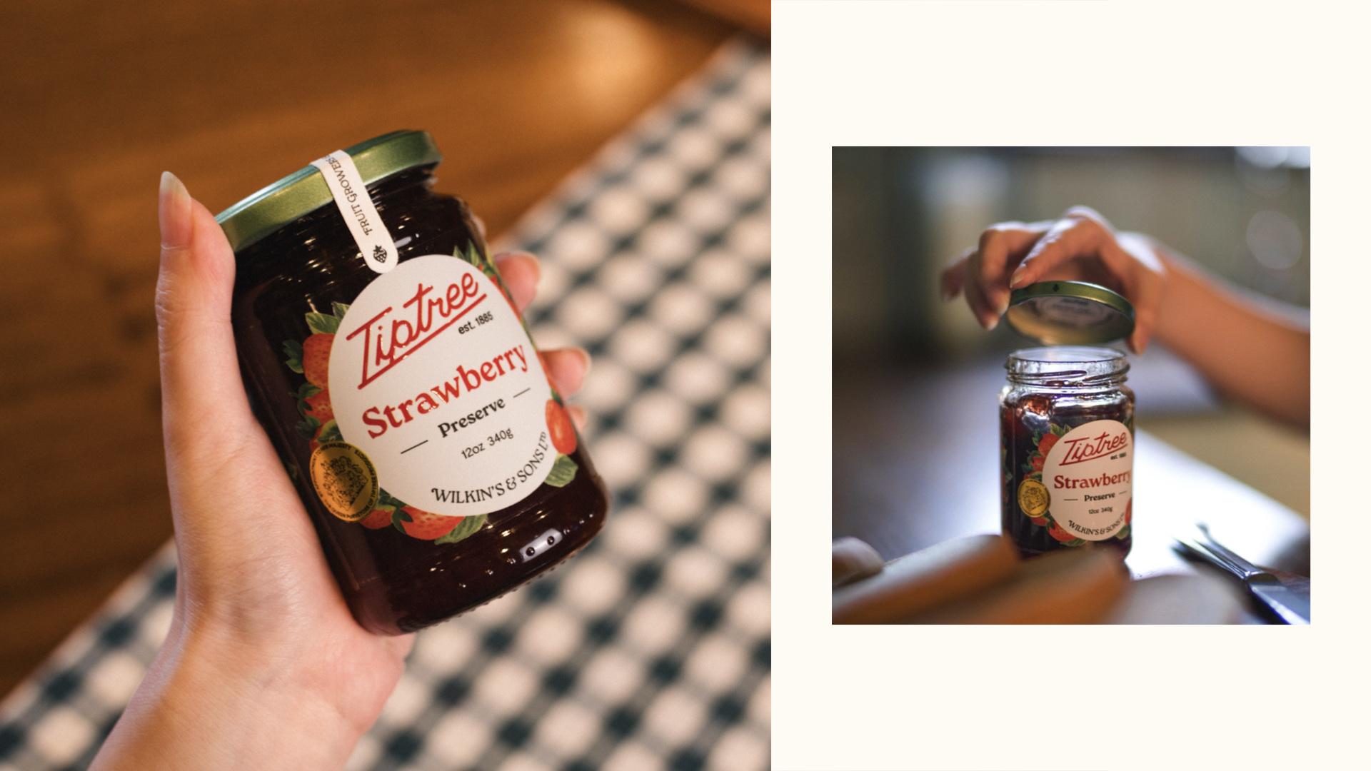
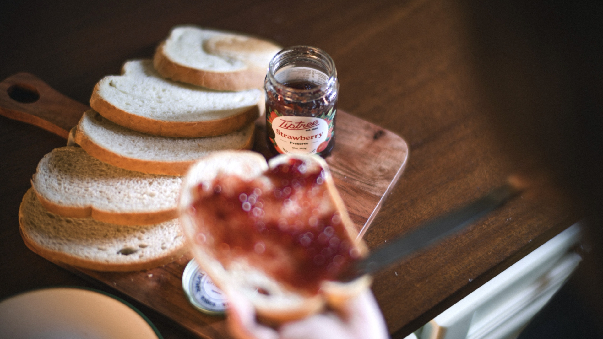
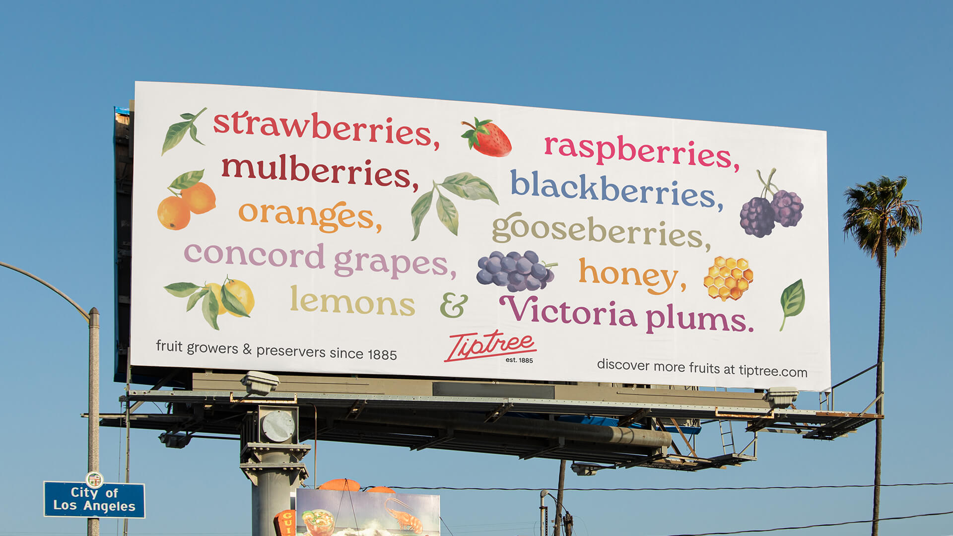
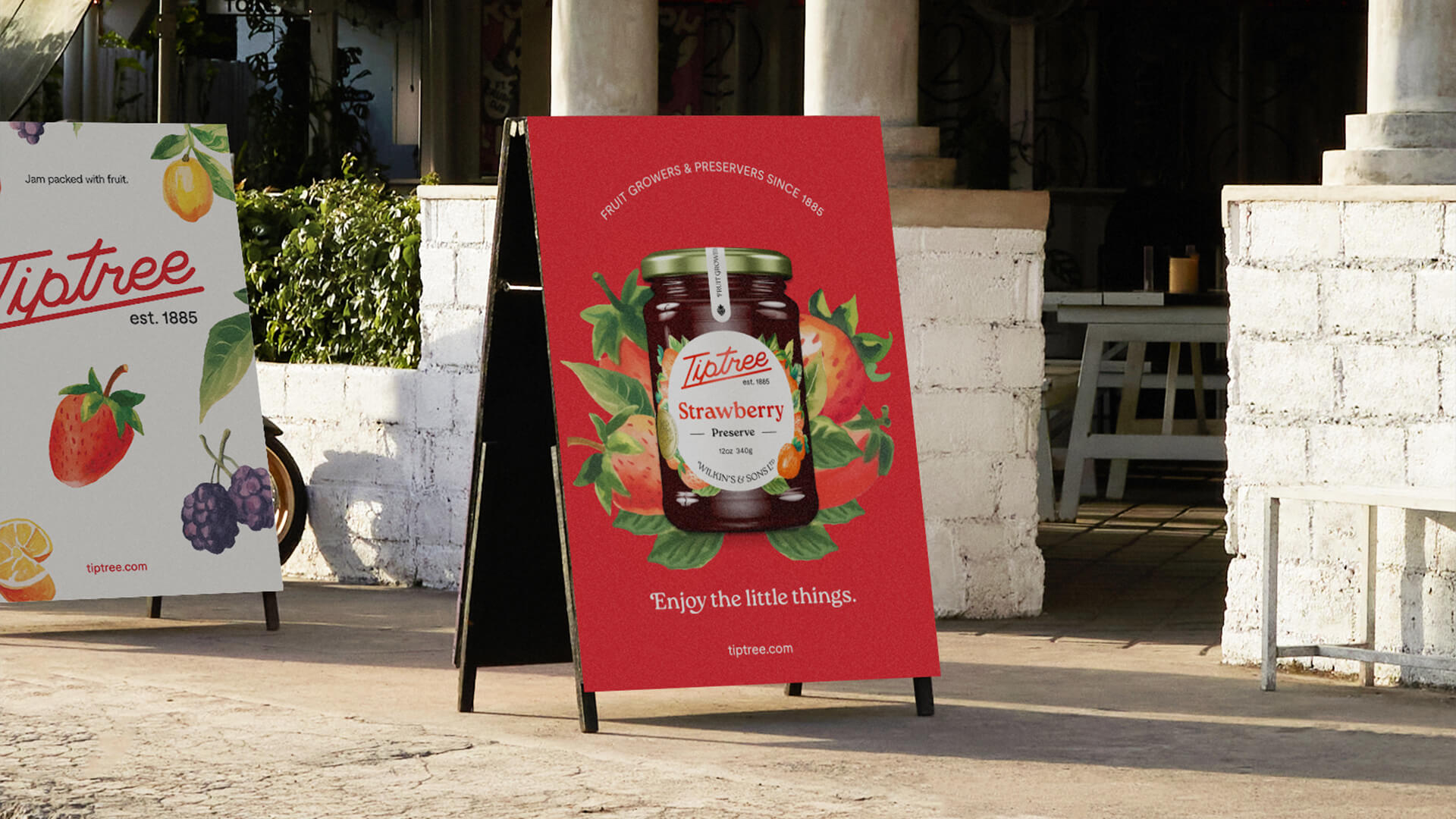
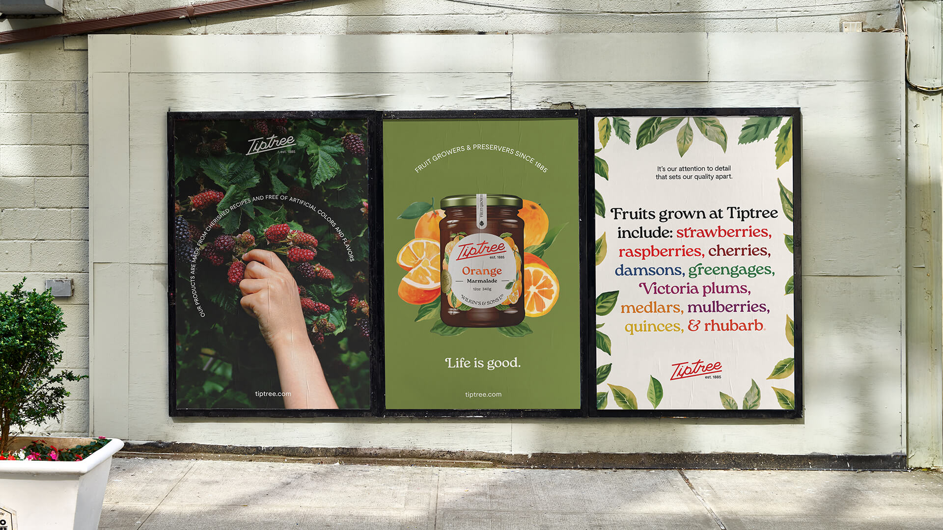
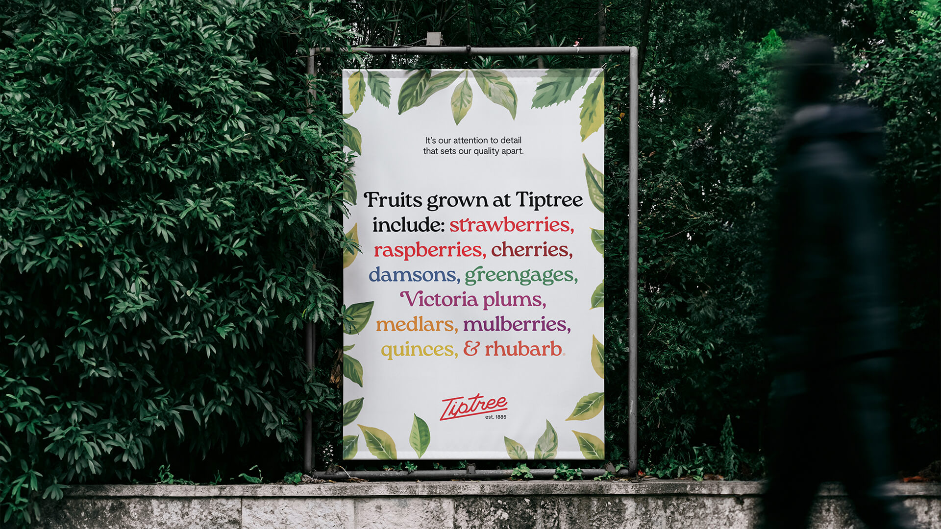
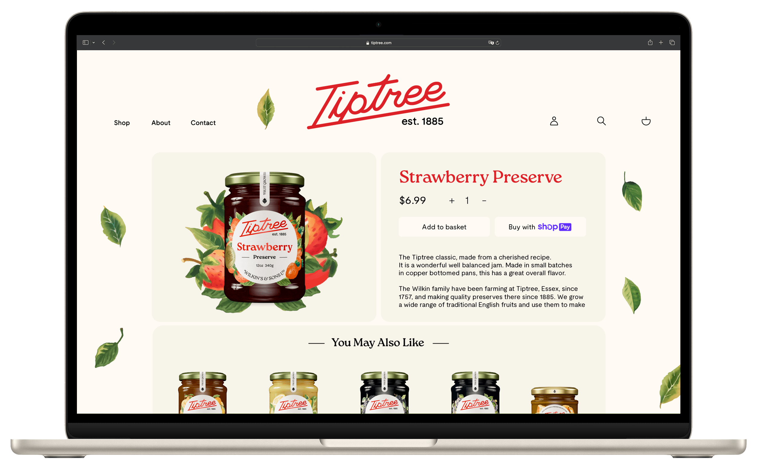
Complete packaging rebrand of Wilkin & Sons Tiptree. The redesign aims to infuse Tiptree with a fresh, friendly appeal that resonates with U.S. consumers, capturing the spirit of American mornings. By expanding the product line to include an array of new, exciting flavors, Tiptree positions itself as a forward-thinking brand ready to invigorate the breakfast tables across the nation. The rebrand focuses on simplicity and warmth, mirroring the comforting embrace of daybreak, ensuring every interaction is as inviting and flavorful as the products themselves.
Collaborative project with Janine Hernandez
Logomark
We retained key visual elements like the signature script and slanted underline, recognizing their significance in maintaining a connection to the brand’s history and heritage.
Principal Display Panel
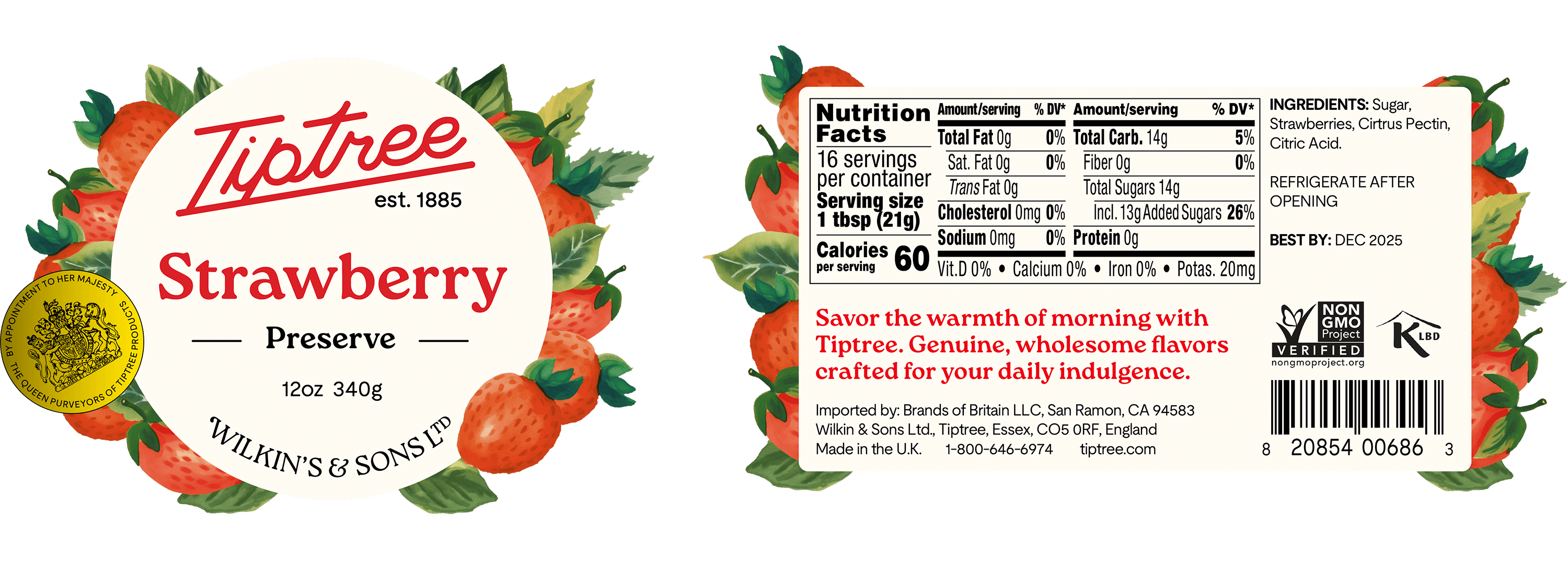
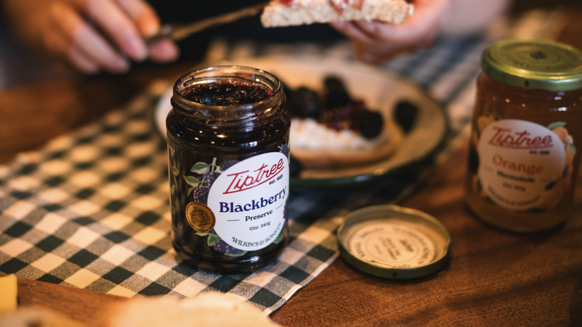
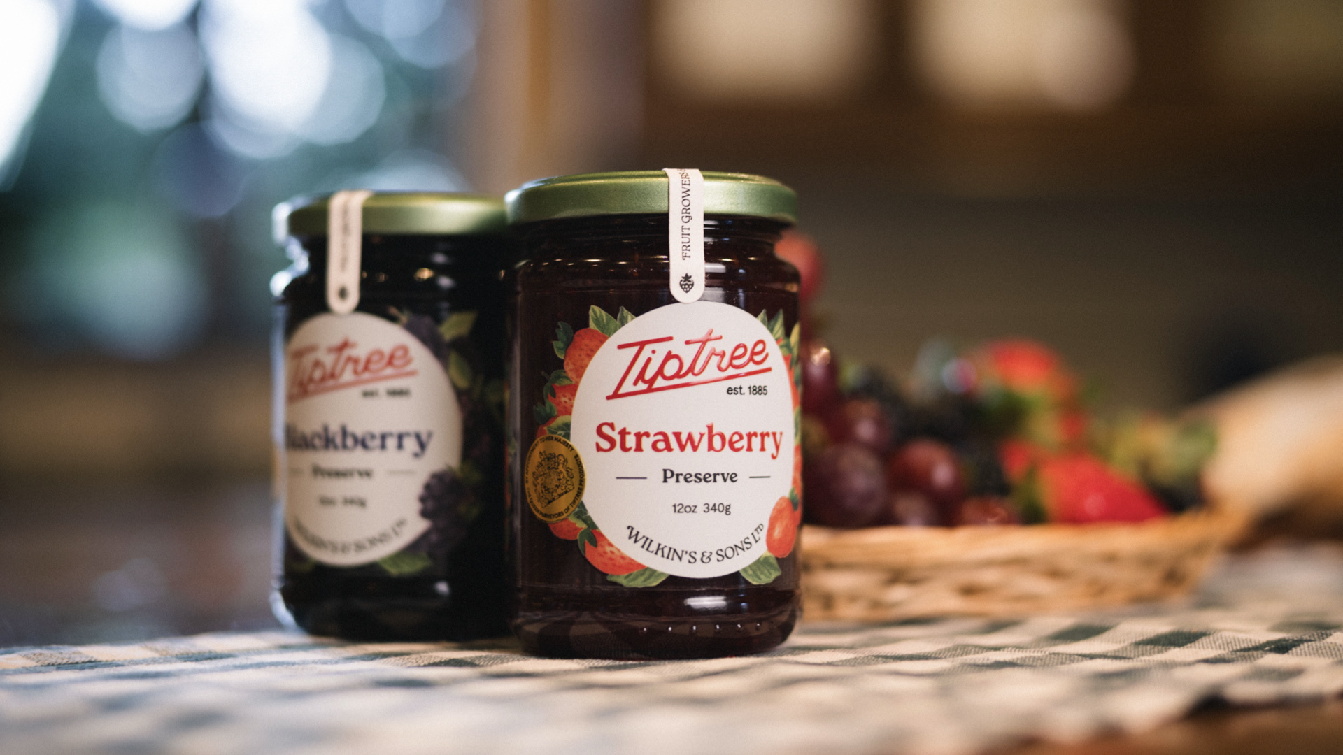
We chose to maintain a similar label shape for consistency throughout the rebranding process. Drawing inspiration from the old label design, we refined it to establish a more polished and sophisticated look, enabling us to establish a clear hierarchy for presenting essential information.
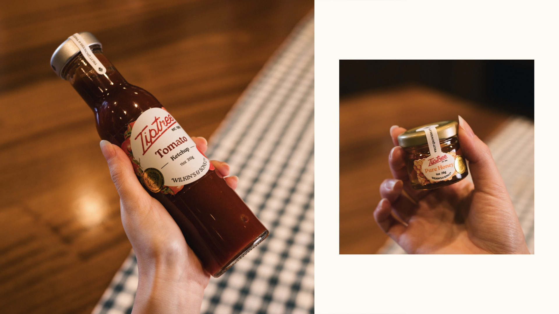
Product Line
Digital Renderings
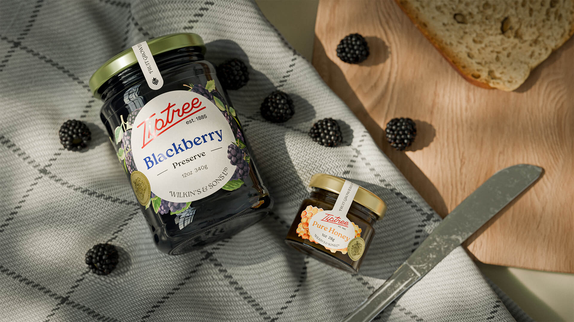
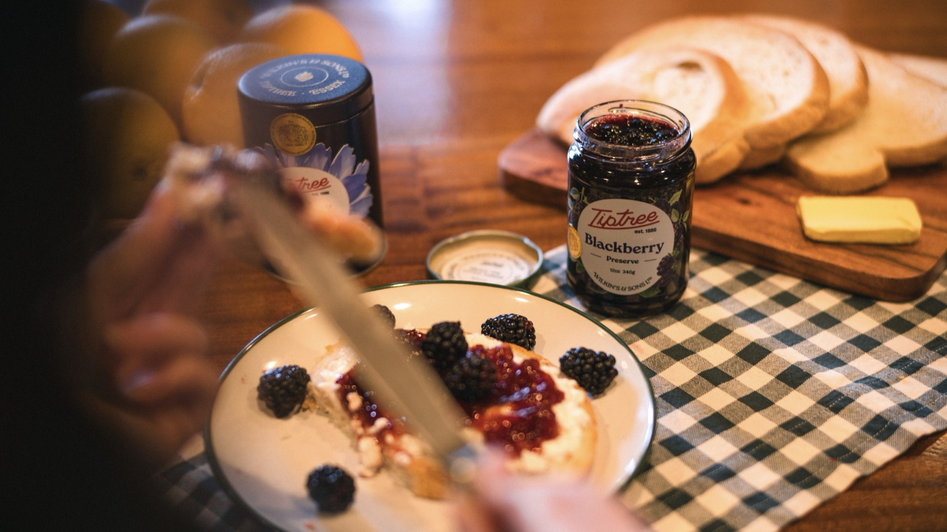
Editorial Photography
Brand Activation
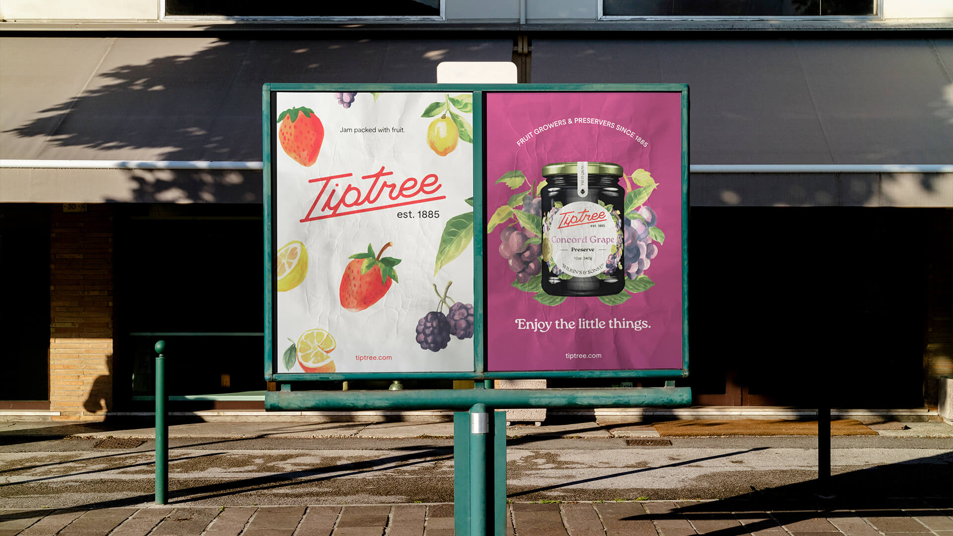
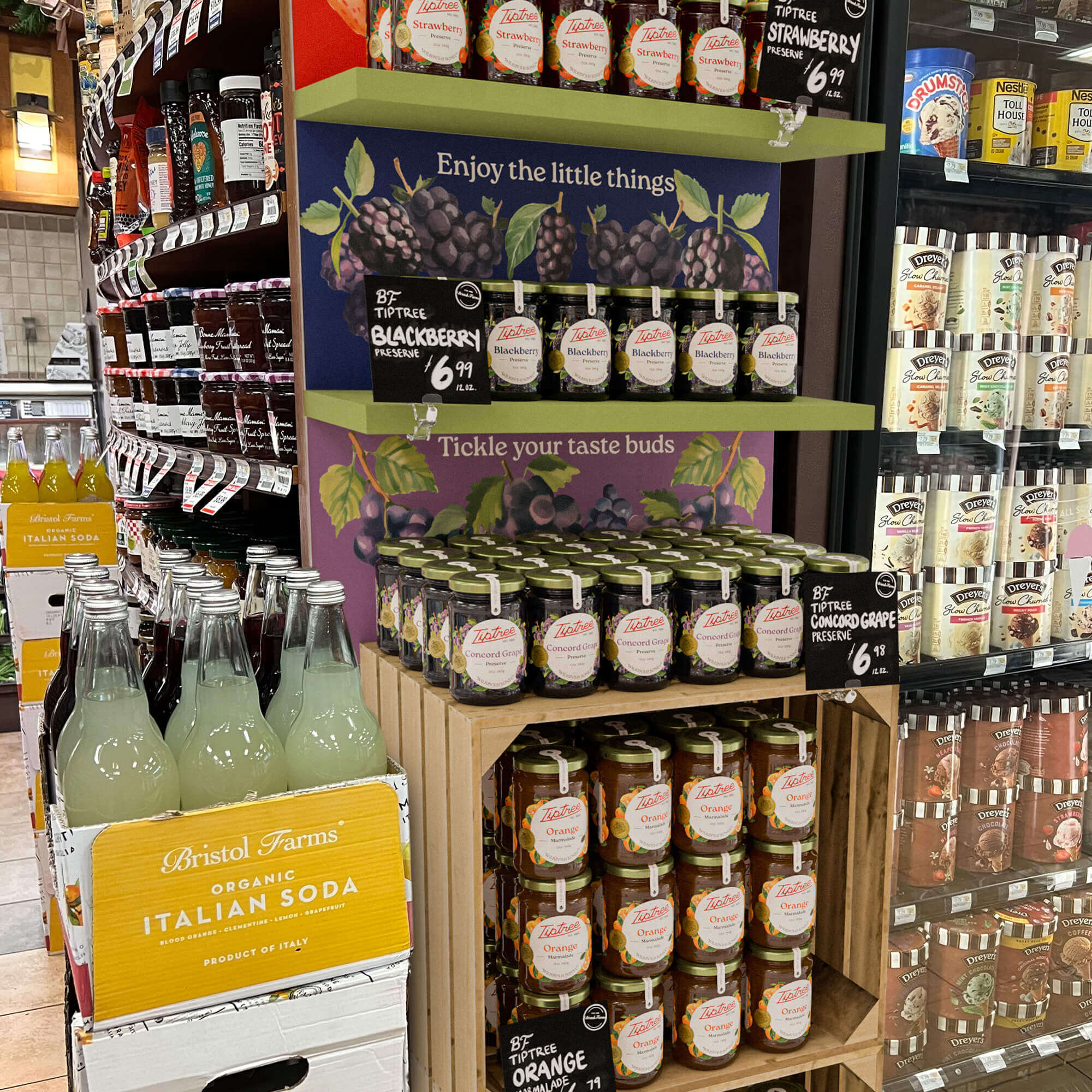
Retail Display
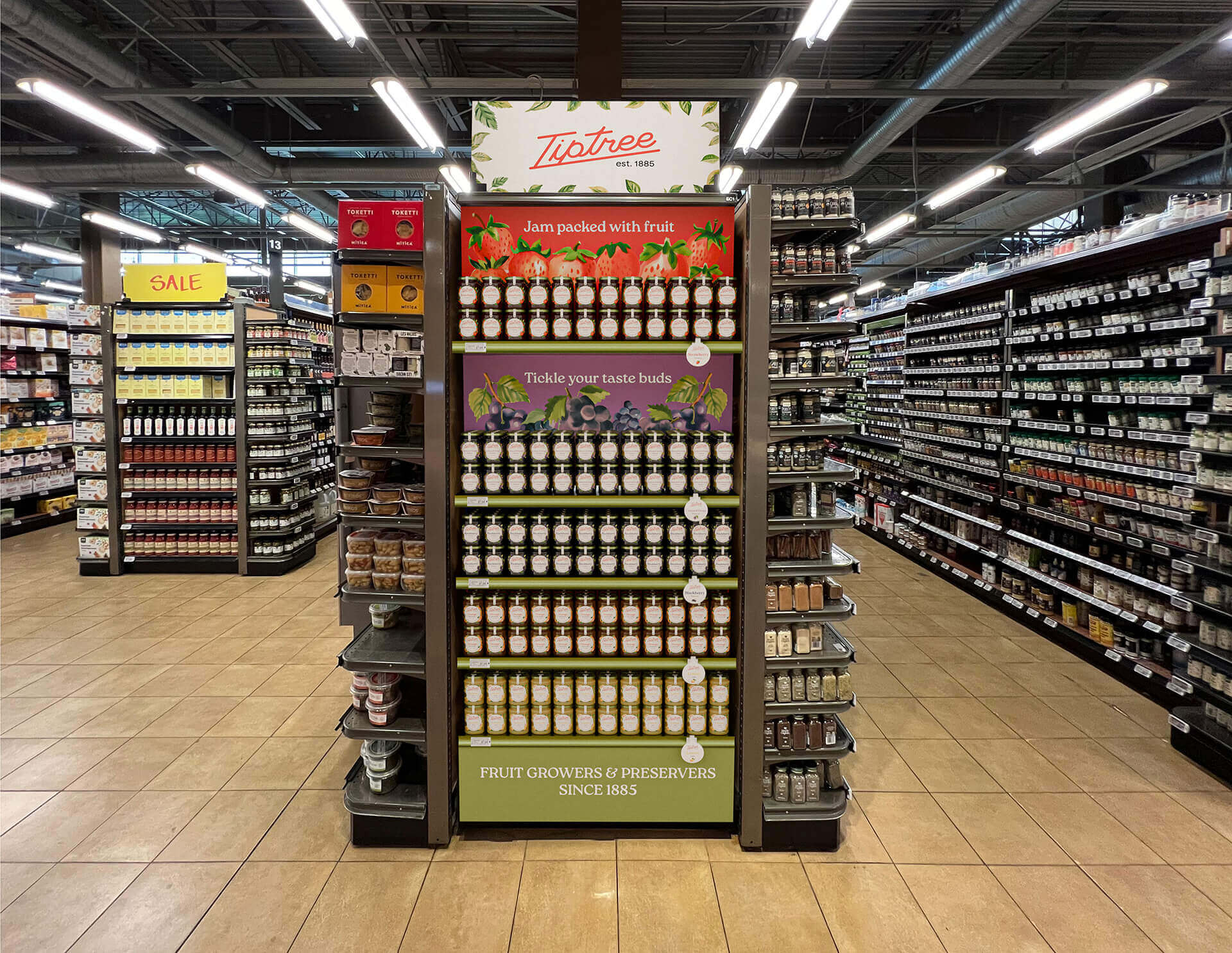
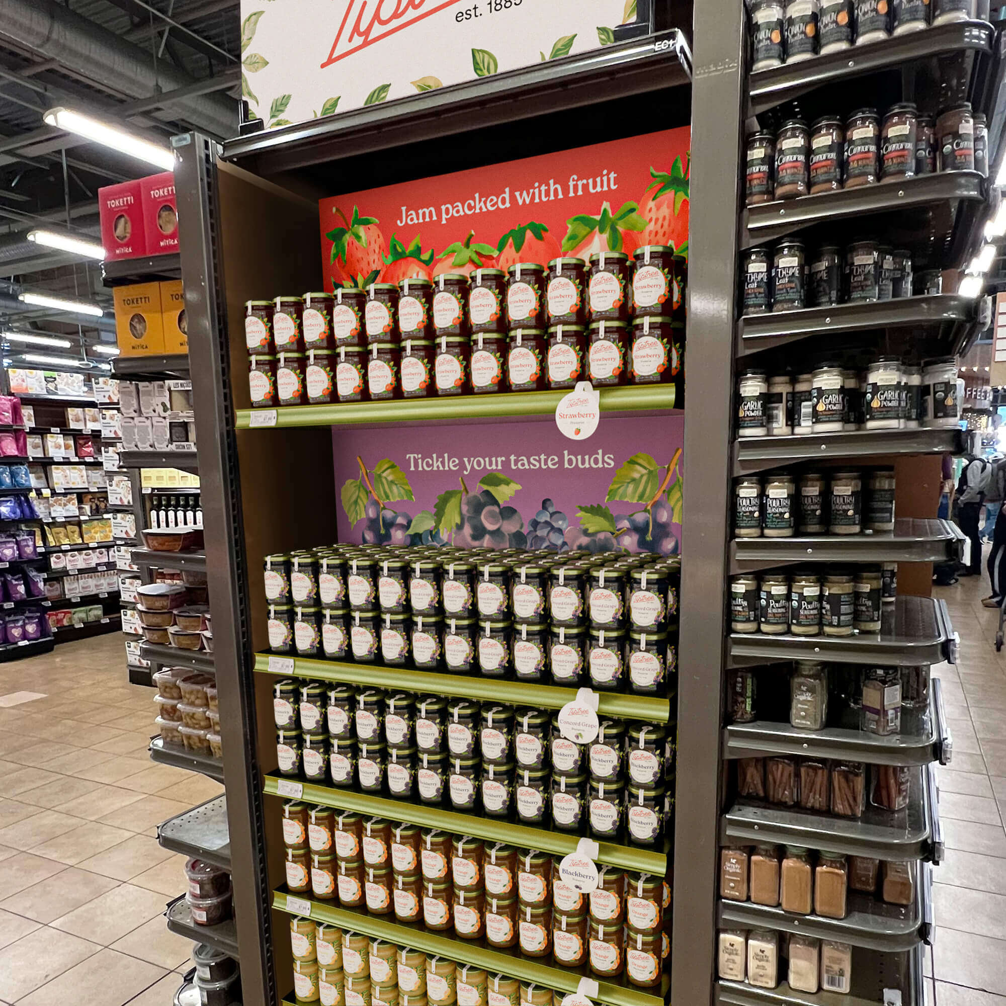
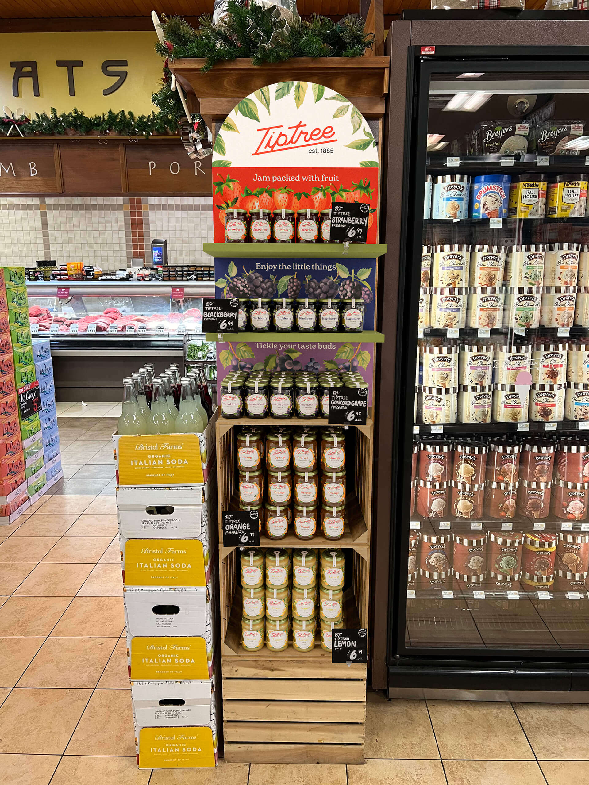
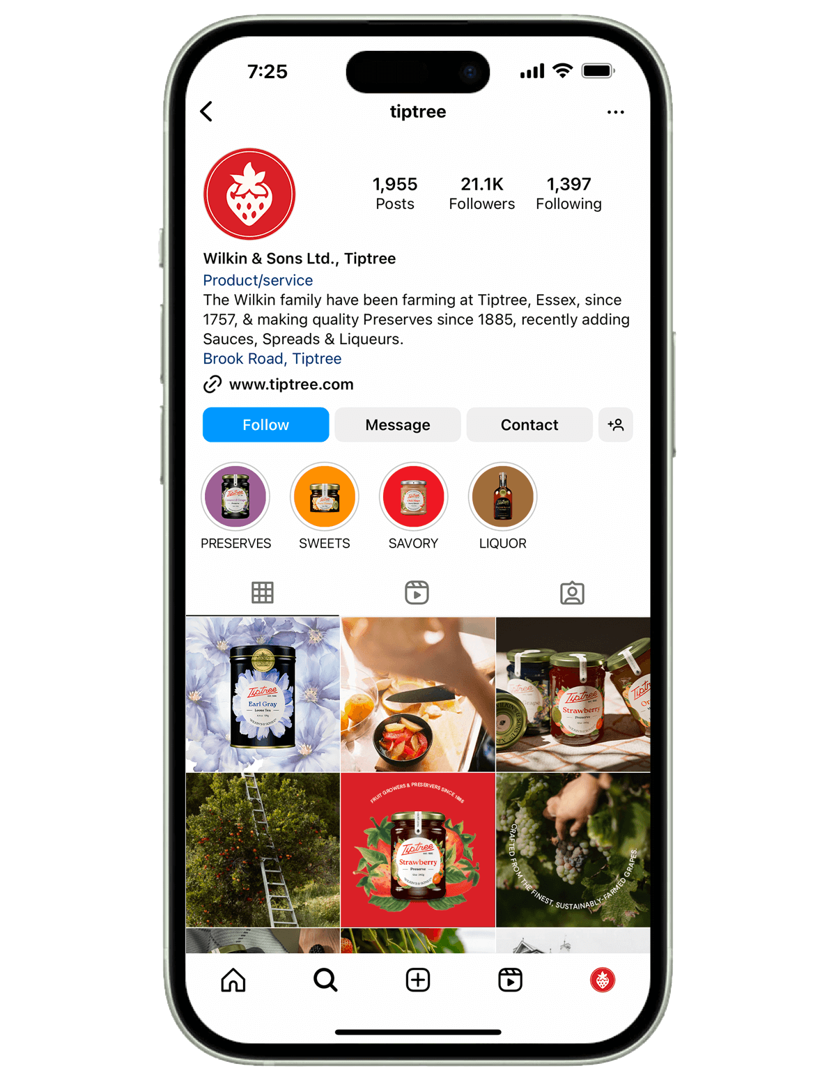
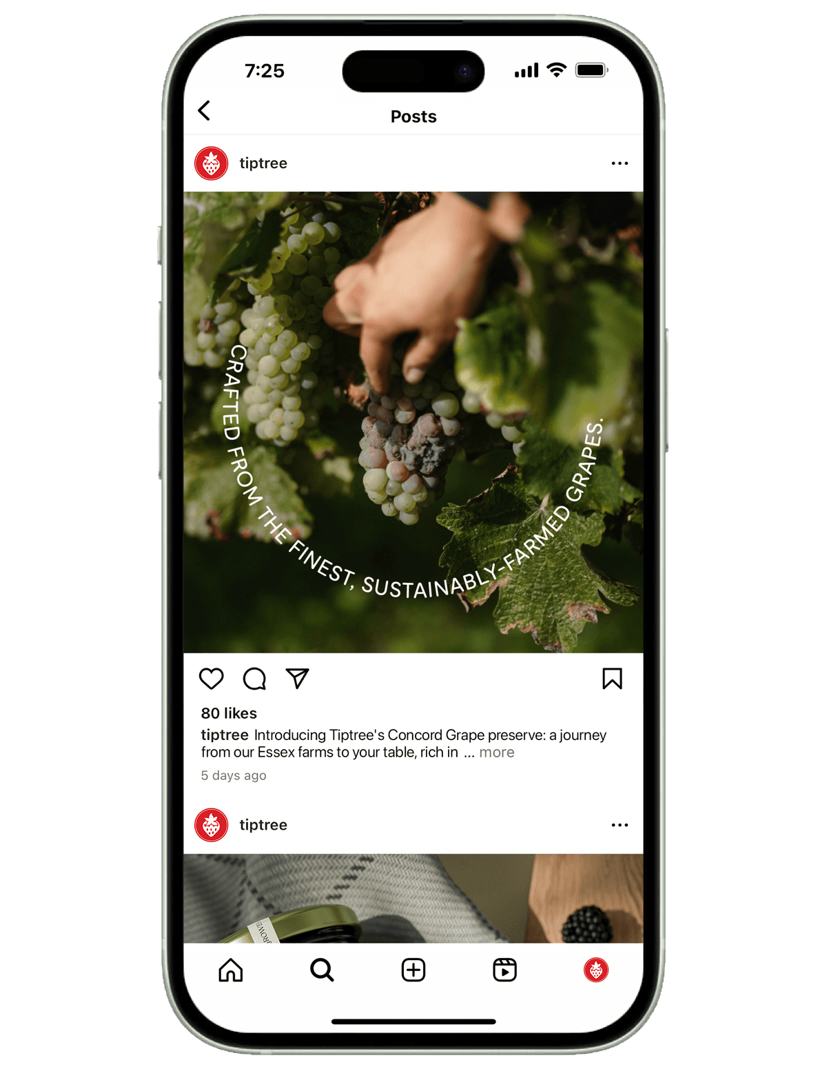
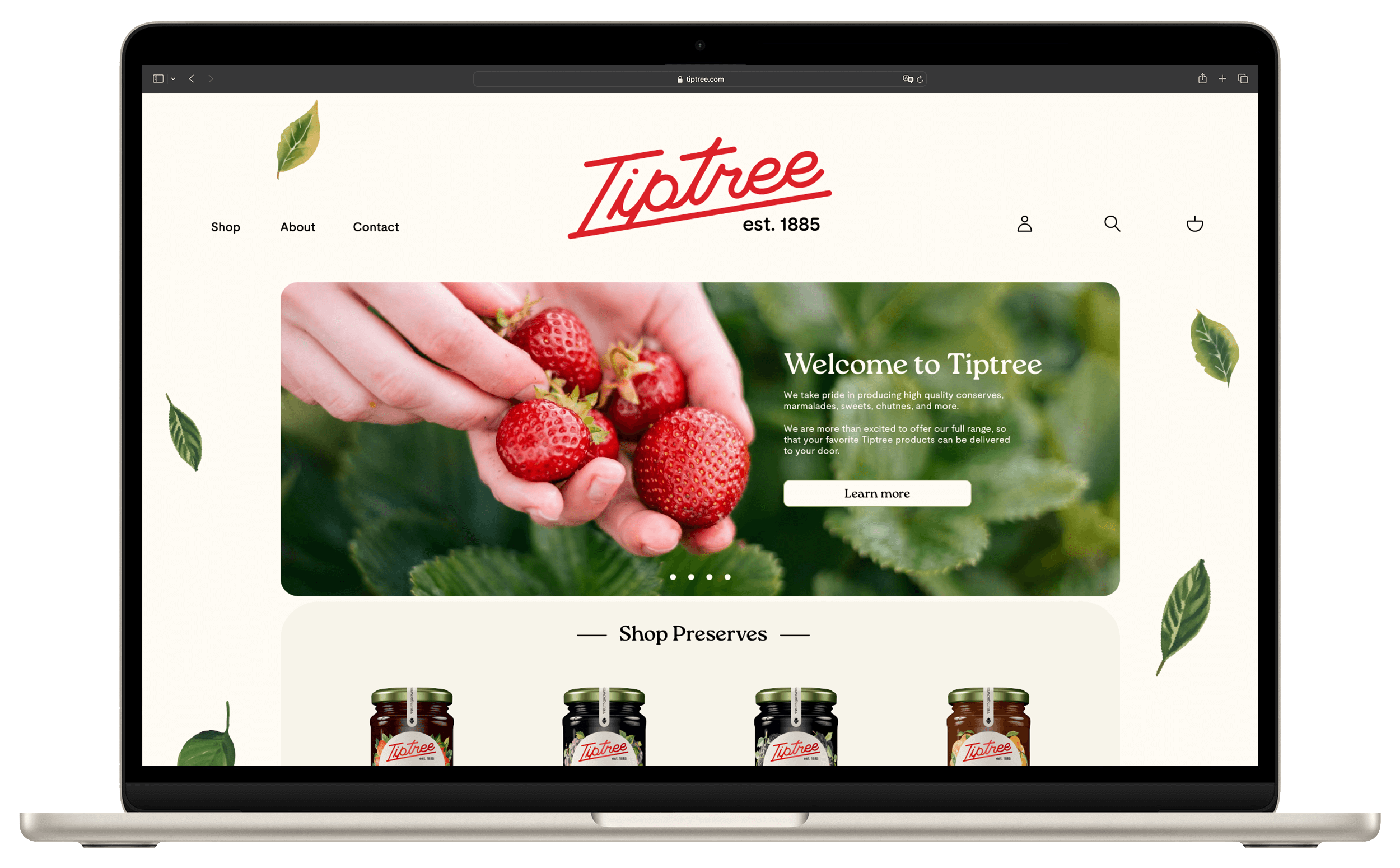
Digital Media
Special Thanks:
Paula Hansanugrum, Gerardo Herrera,
Kaitlynn Gibson: Virtual Packaging
Craig & Leo: Kongsberg Team
Lingyu Xu: 3D Modeling Freelance
Vicky Lin: Illustration Freelance
Jeffrey Su: Camera
Kerrie Chu: Hand Model
Scarlit Bloome, Wendy Thai, Ana Vazquez, Grace Johnson, Alexander Lieberman, Ming Tai