Rocket Lab Redesign
Identity and motion design
Complete visual identity redesign for Rocket Lab. Rocket Lab is a private American aerospace manufacturer and satellite launch service provider. The visual redesign aims to showcase Rocket Lab's unique blend of cutting-edge technology and down-to-earth culture, creating a brand that resonates specifically with aerospace engineers and students, while inspiring a new generation of space enthusiasts.
→ Graphis New Talent Awards 2024, Silver
→ Graphis New Talent Awards 2024, Silver
Logomark
The new Rocket Lab logo captures the essence of pushing the boundaries of what is possible. The curvature of the lines creates the illusion of bending space and time, implying innovation and the unique qualities of Rocket Lab.
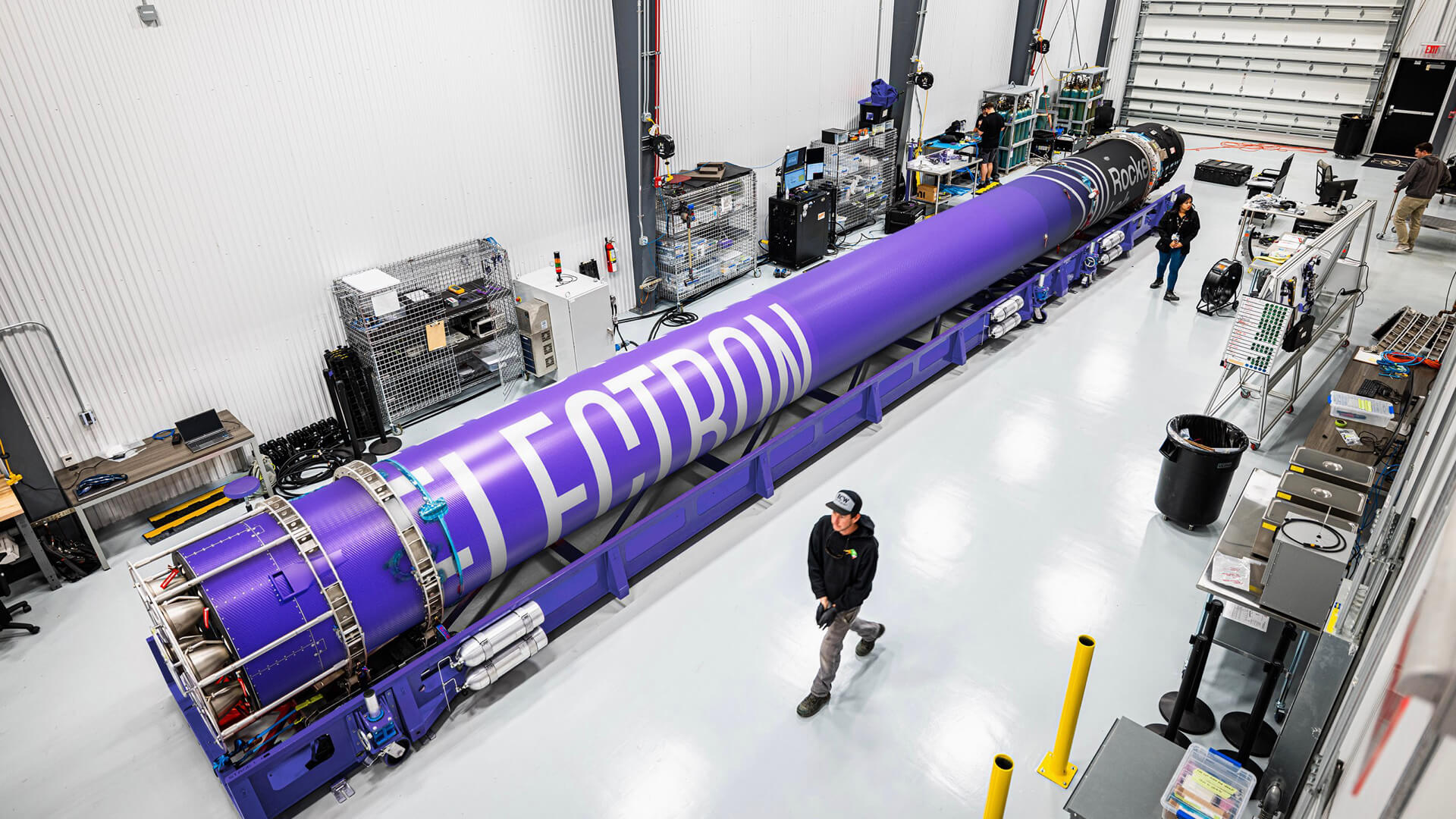
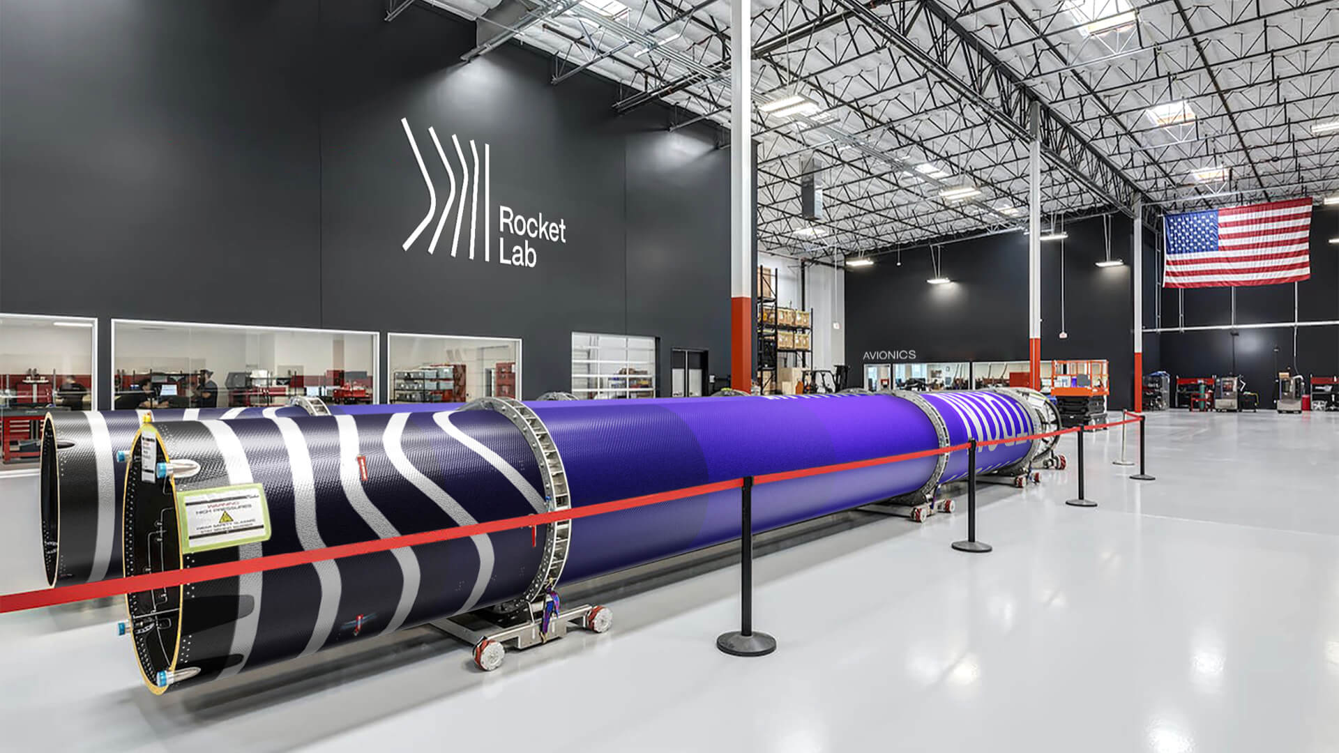
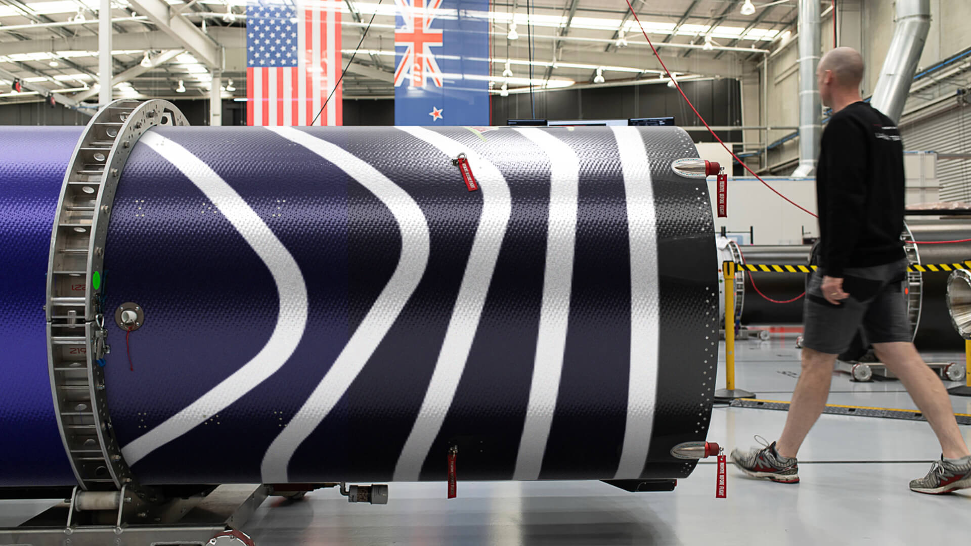
Environmental
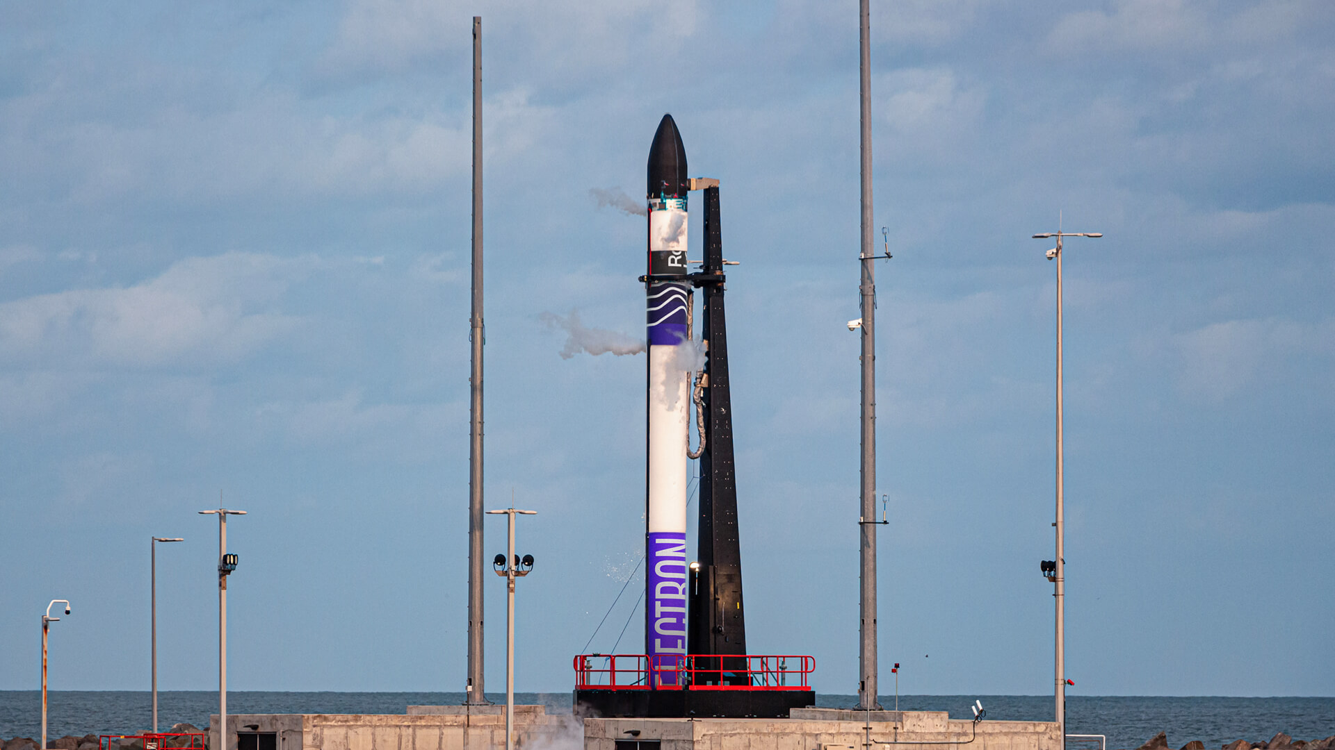
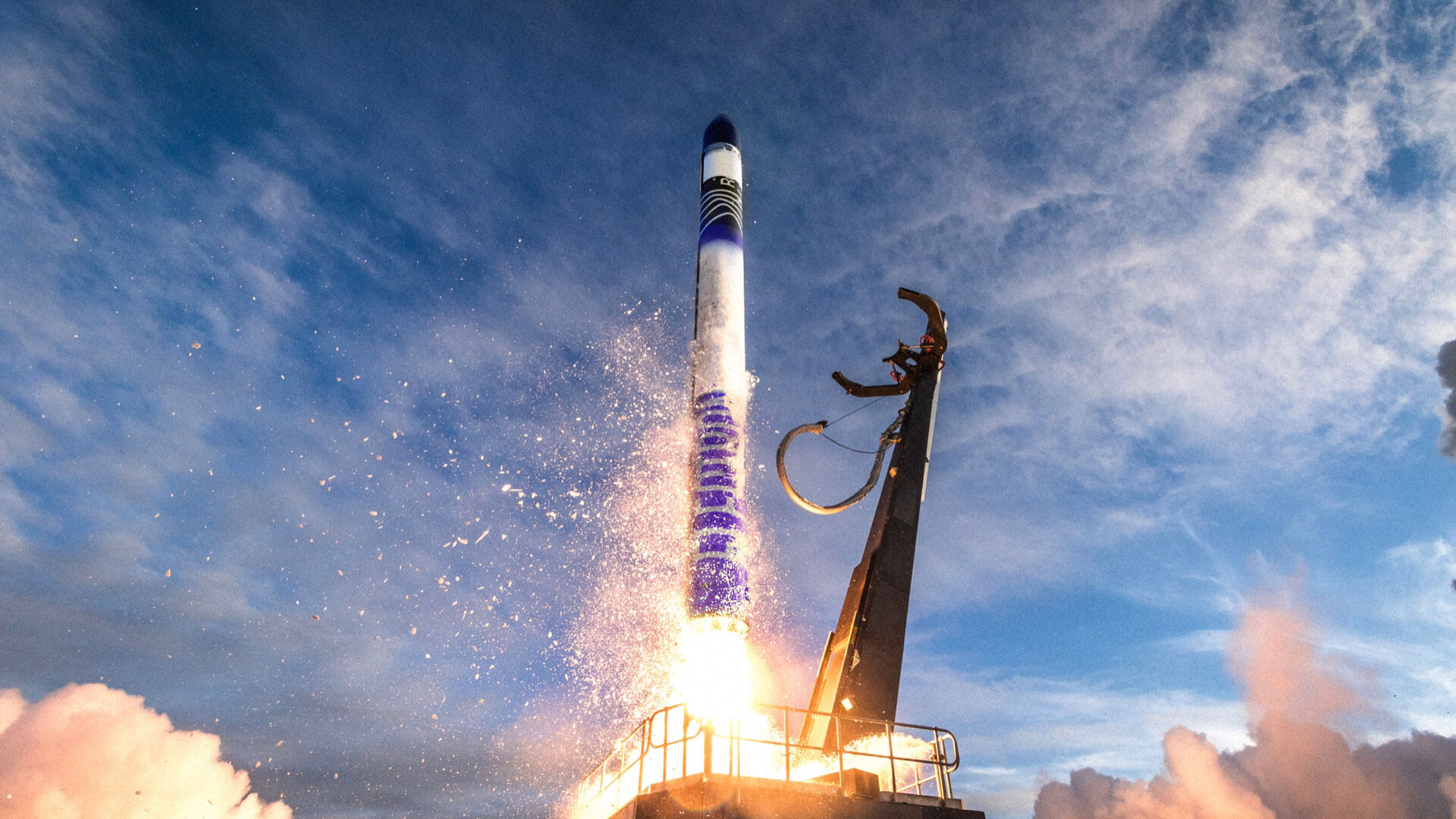
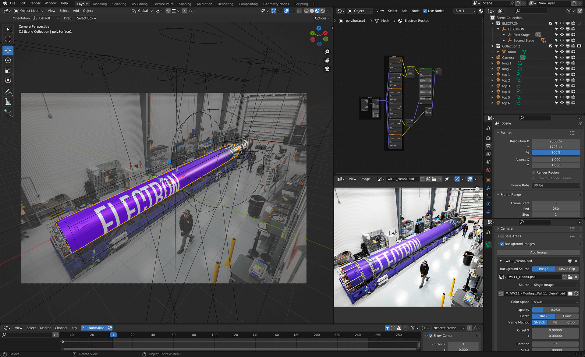
The rocket livery is redesigned with the brand elements with the logo right at the point of separation. During staging, the "Rocket Lab" wordmark separates and keeps on going.
Shortly after launch when the first stage comes back. Rocket Lab sends helicopters to go and catch the first stage in mid-air!


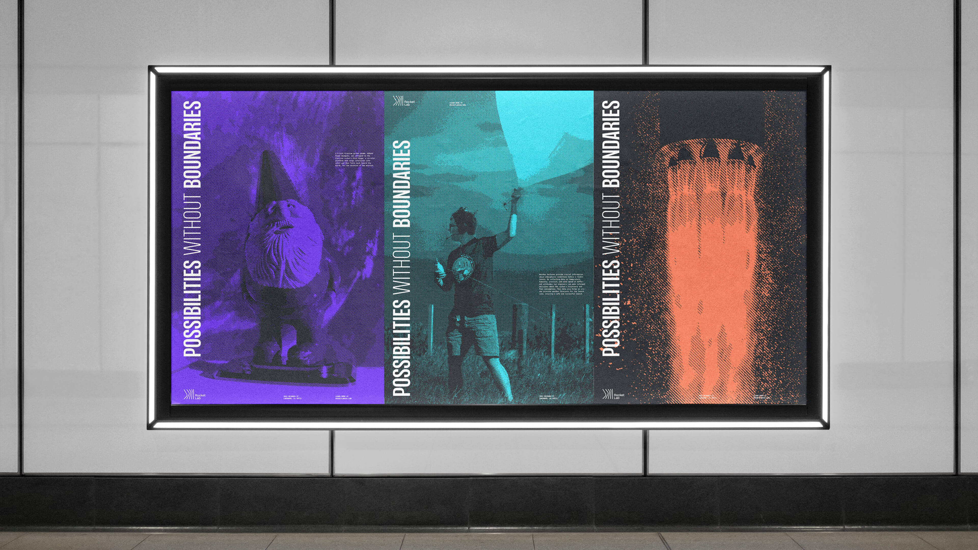
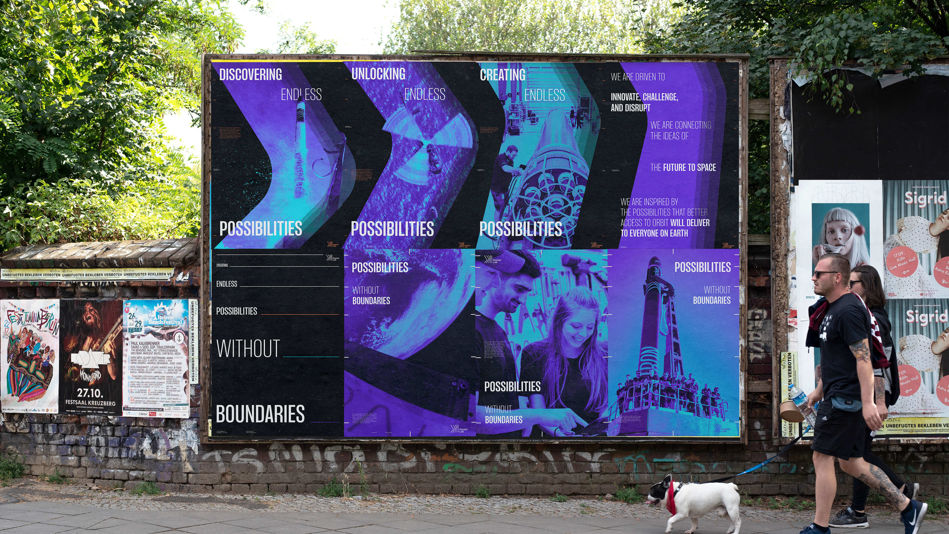
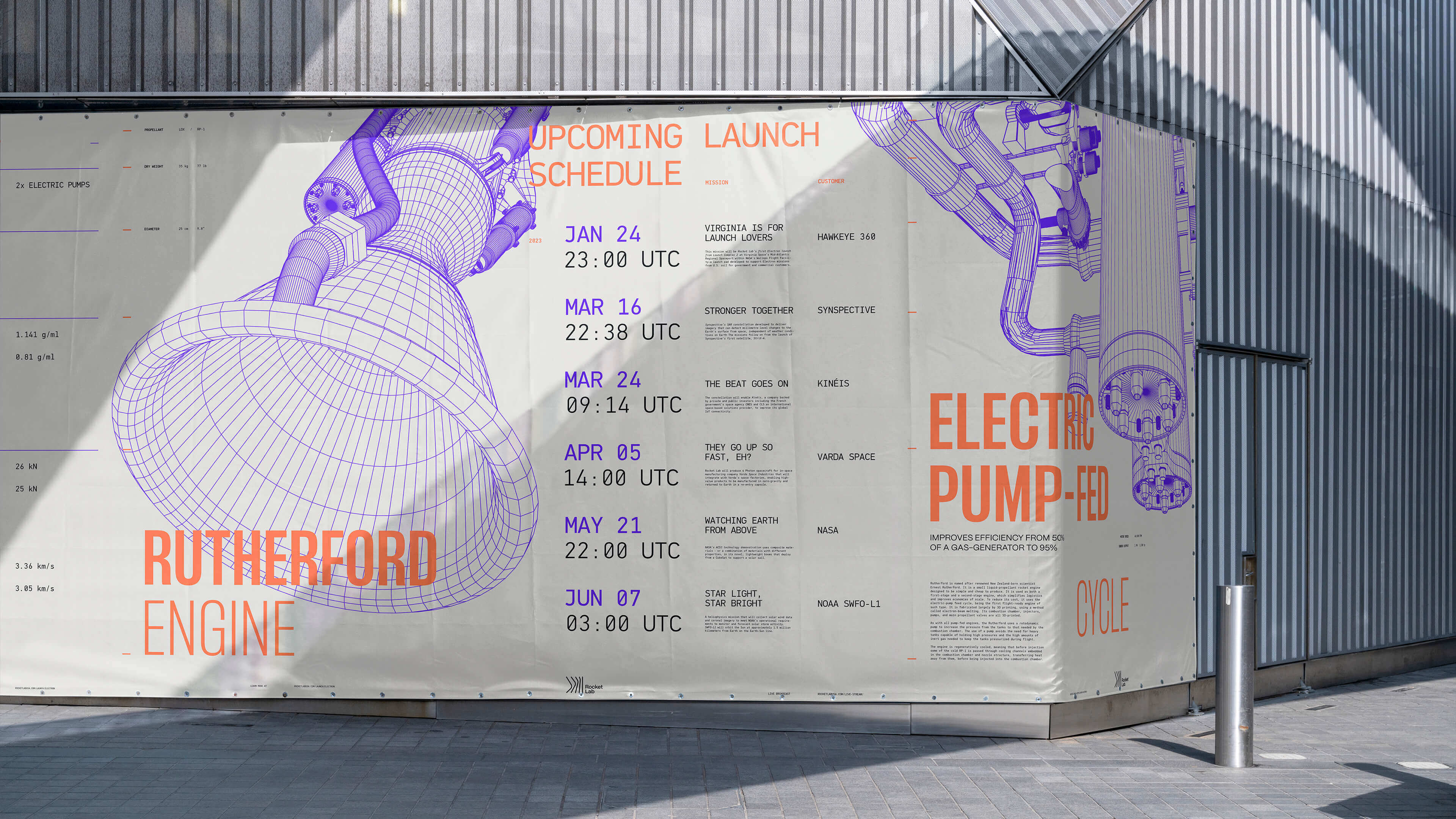
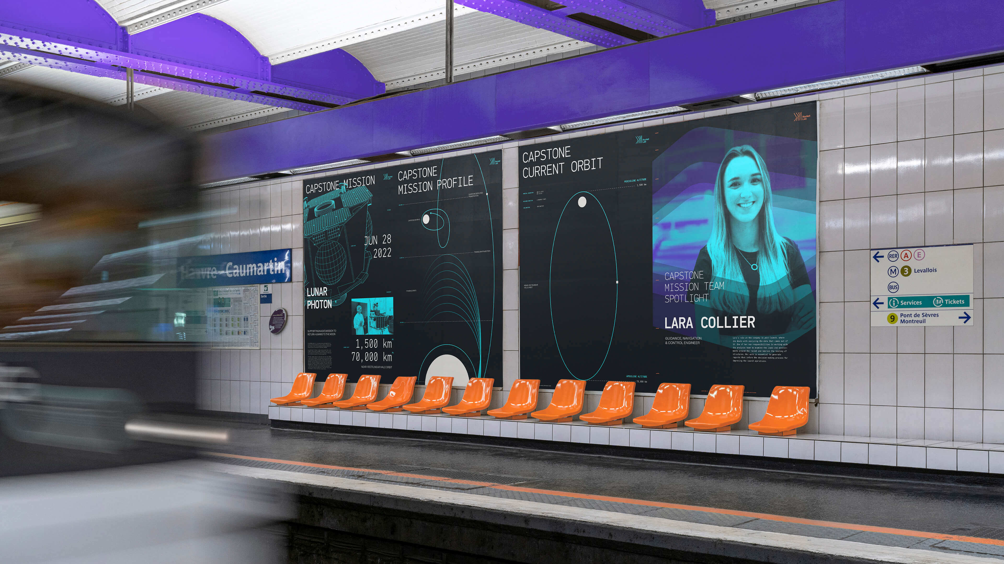
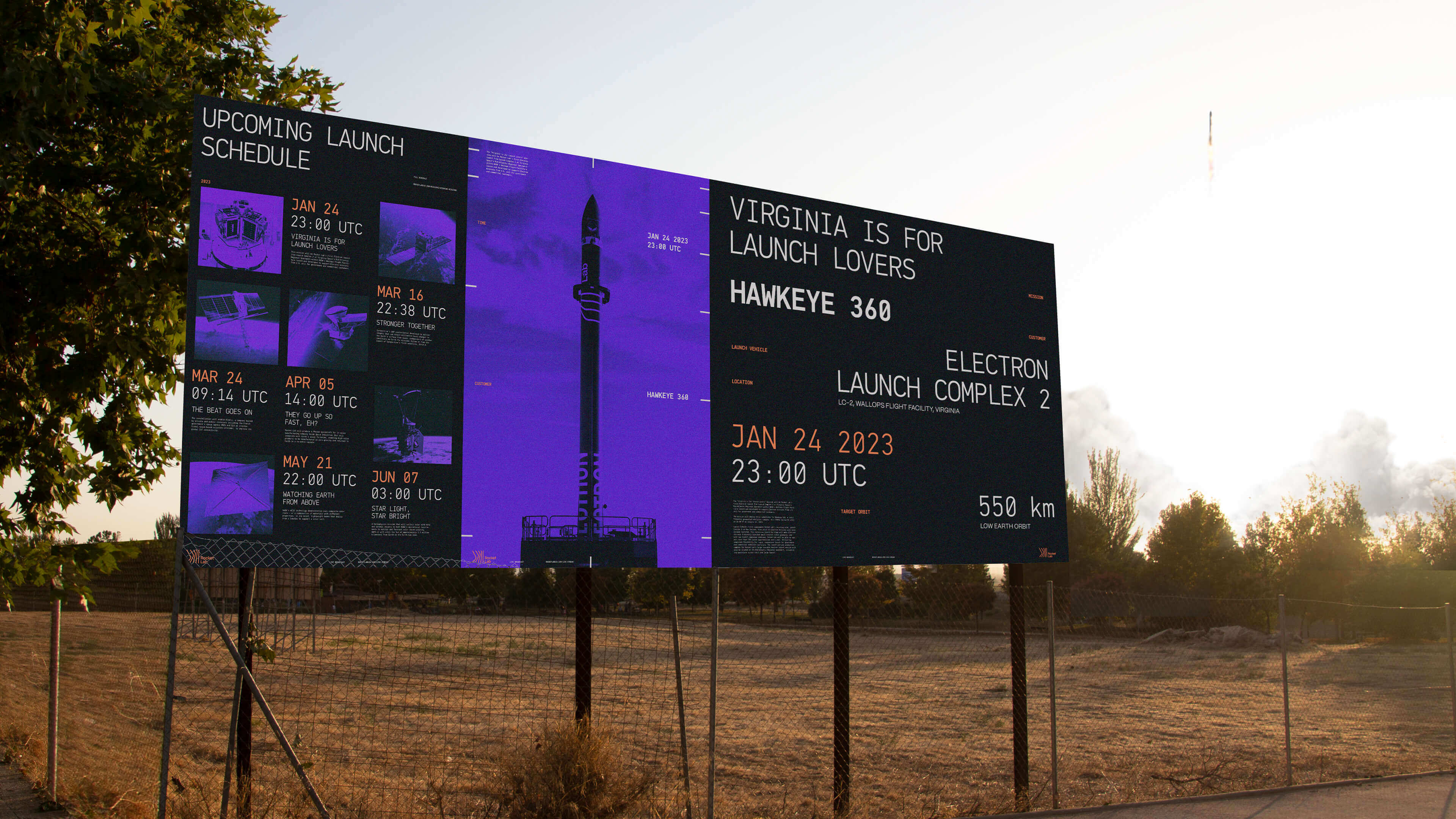
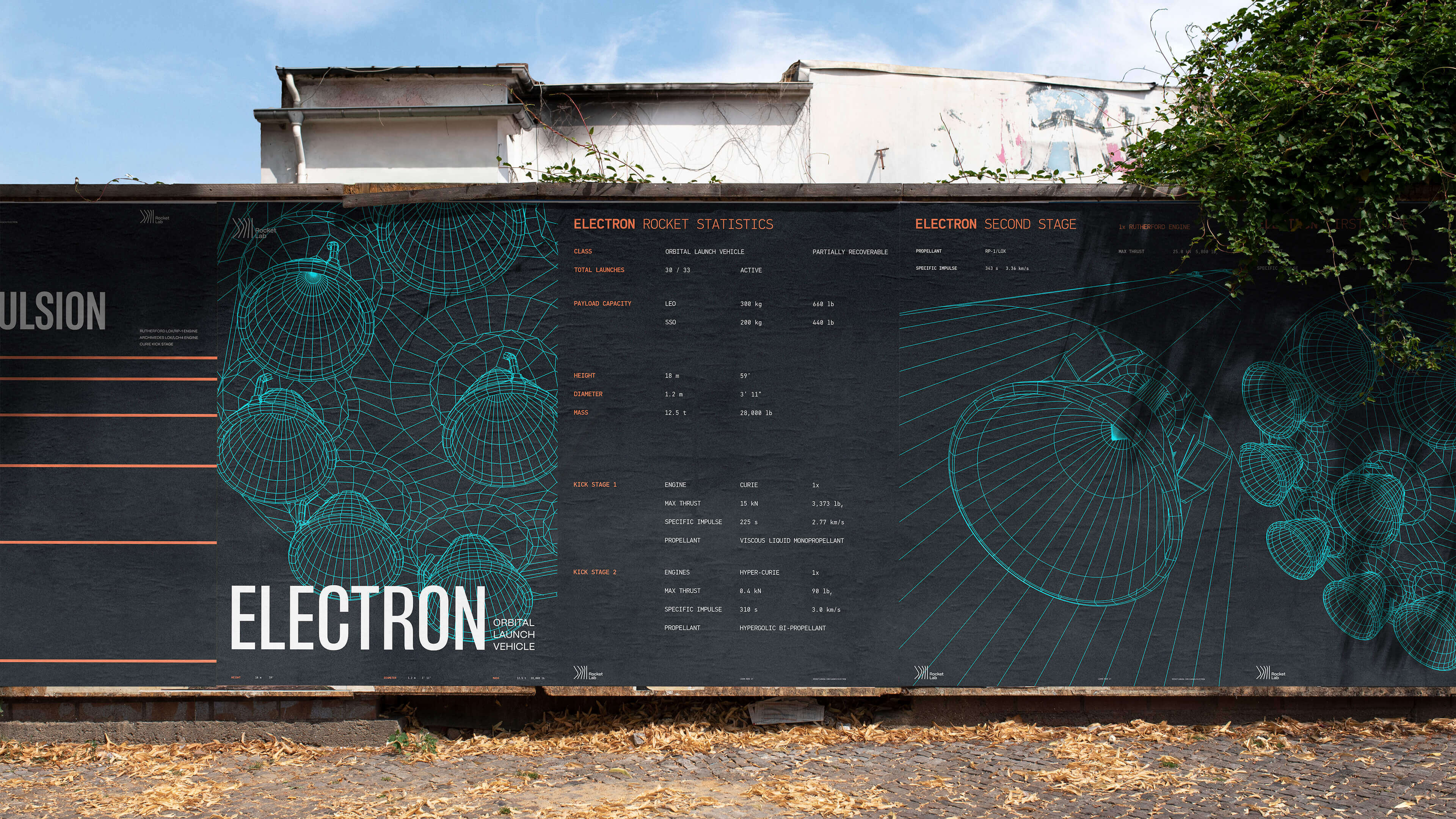
Posters

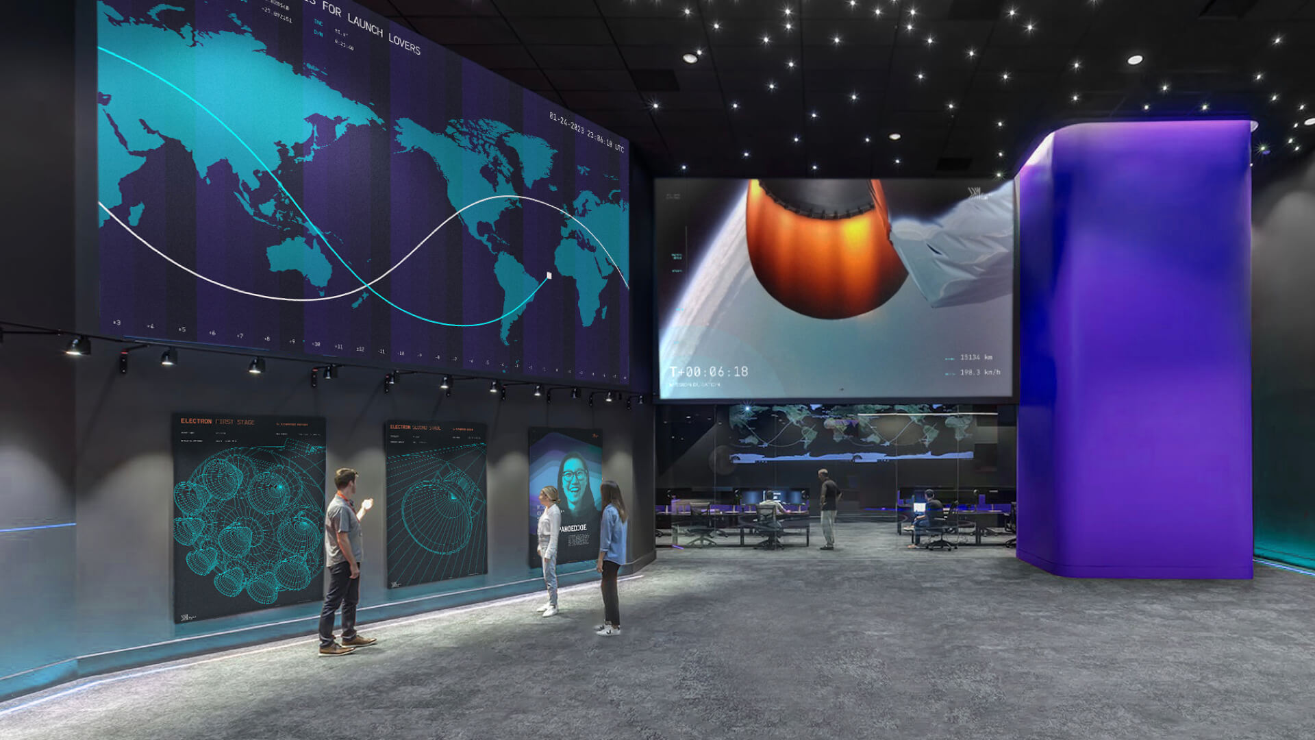
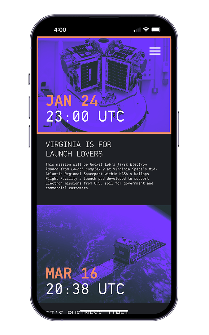
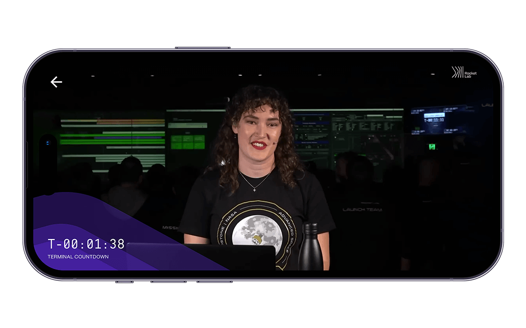
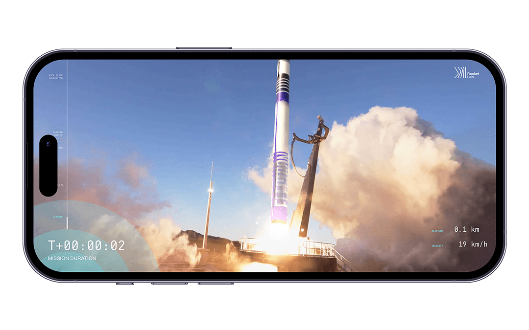
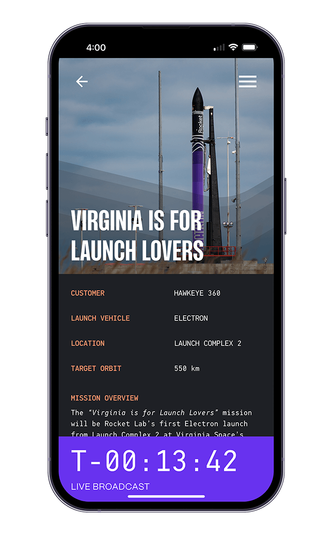
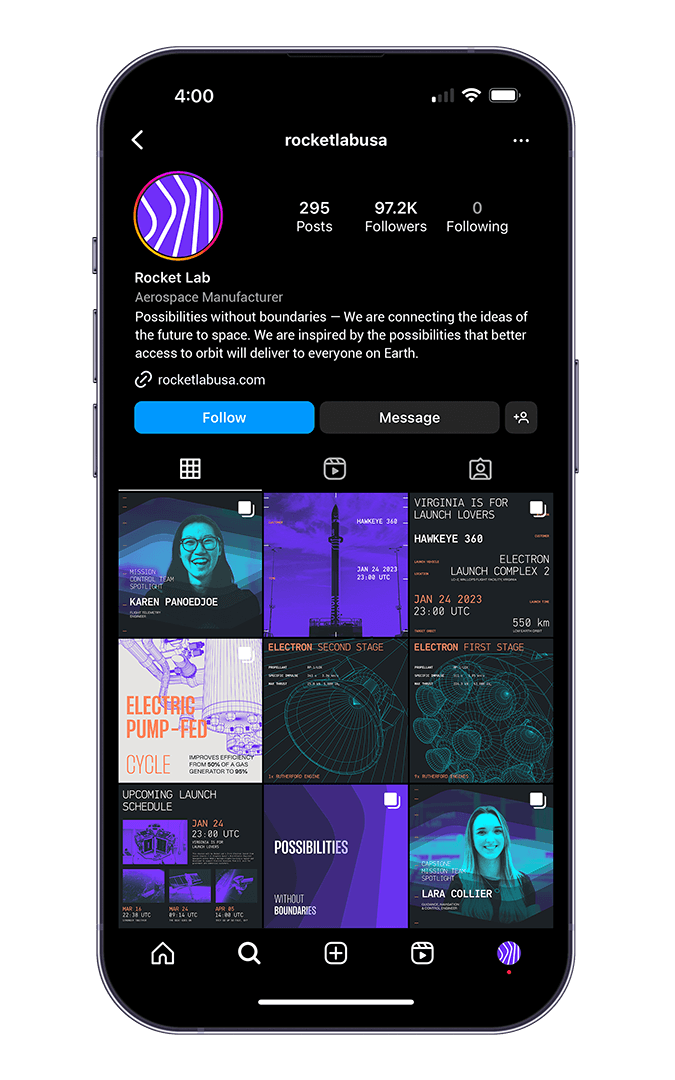
Mobile App & Social Media
The app is designed to help keep track of upcoming launches as well as to watch the live broadcast of the mission.

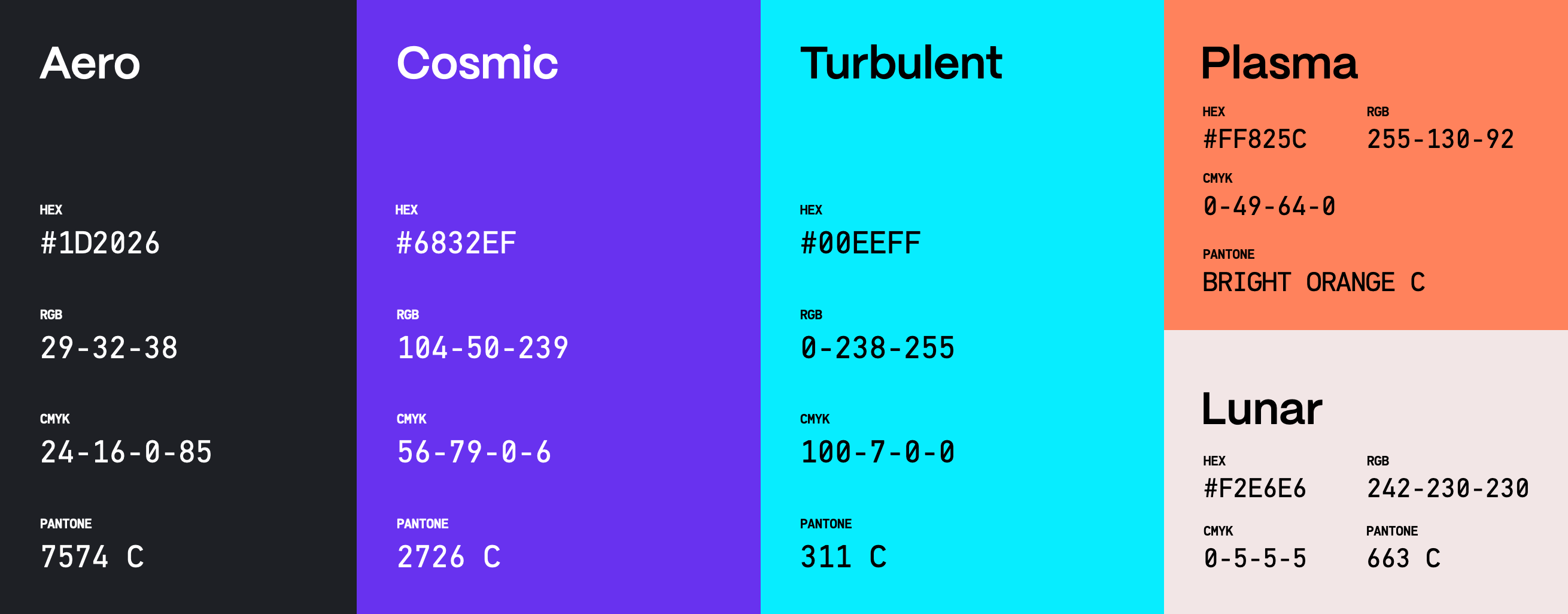
Colors
The new split-complimentary color scheme emphasizes the sense of progress, while also providing a fresh take in the aerospace industry.
Typography
Brand Elements
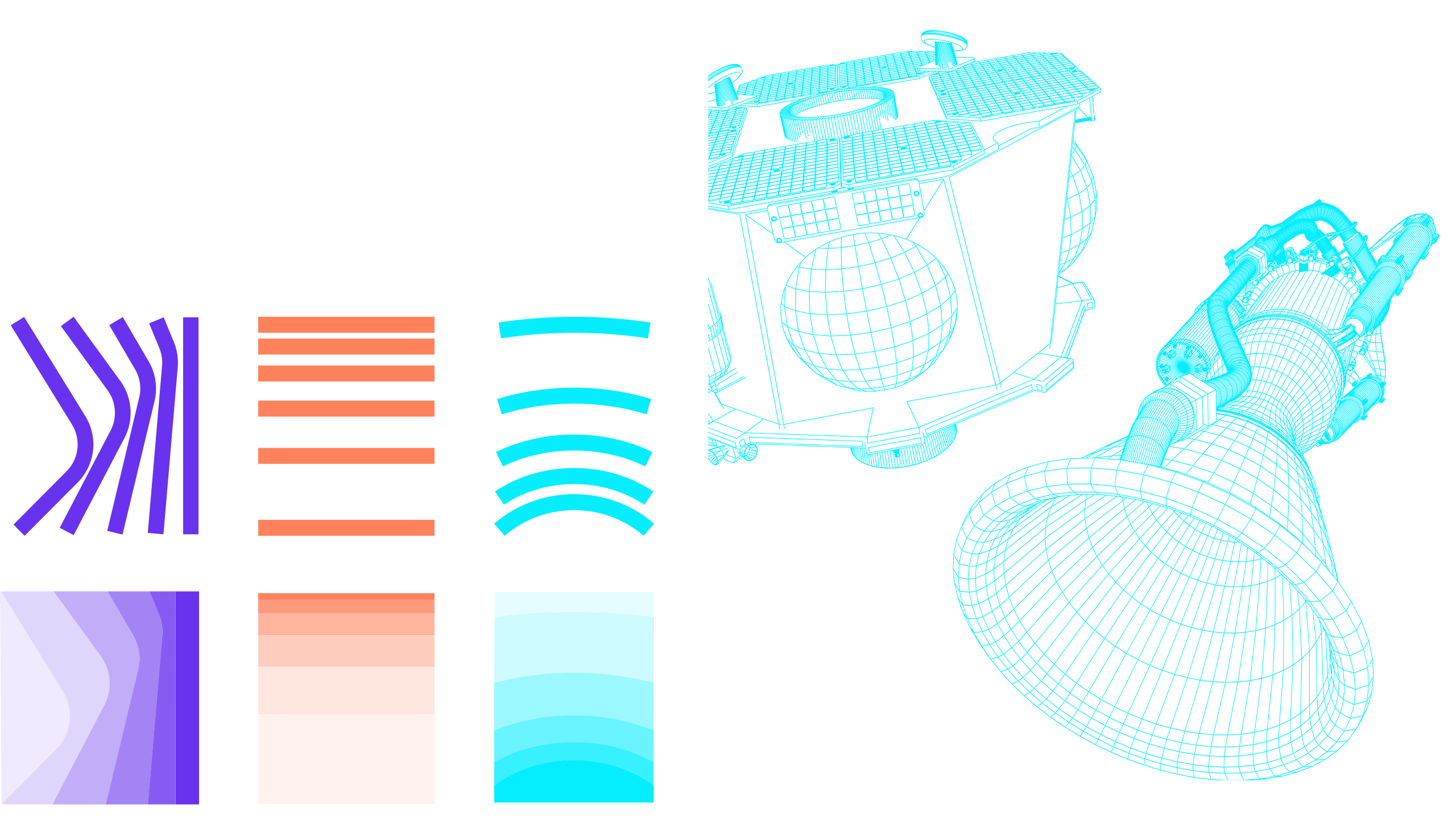
The line patterns represent the different services that Rocket Lab offers: Innovation, Propulsion, Navigation, and Separation. The line patterns can also be used as shape patterns with the gradient conveying the sense of movement.
Process
Perspective plotting, motion tracking, real-time rendering, and crazy camera movements were used inside of Blender 3.5 to create an immersive viewing experience.
Special Thanks:
Ming Tai, Yuqin Ni, Monica Schlaug
© 2026
hanson ma