Noctua Redesign
Identity, packaging, and experience design
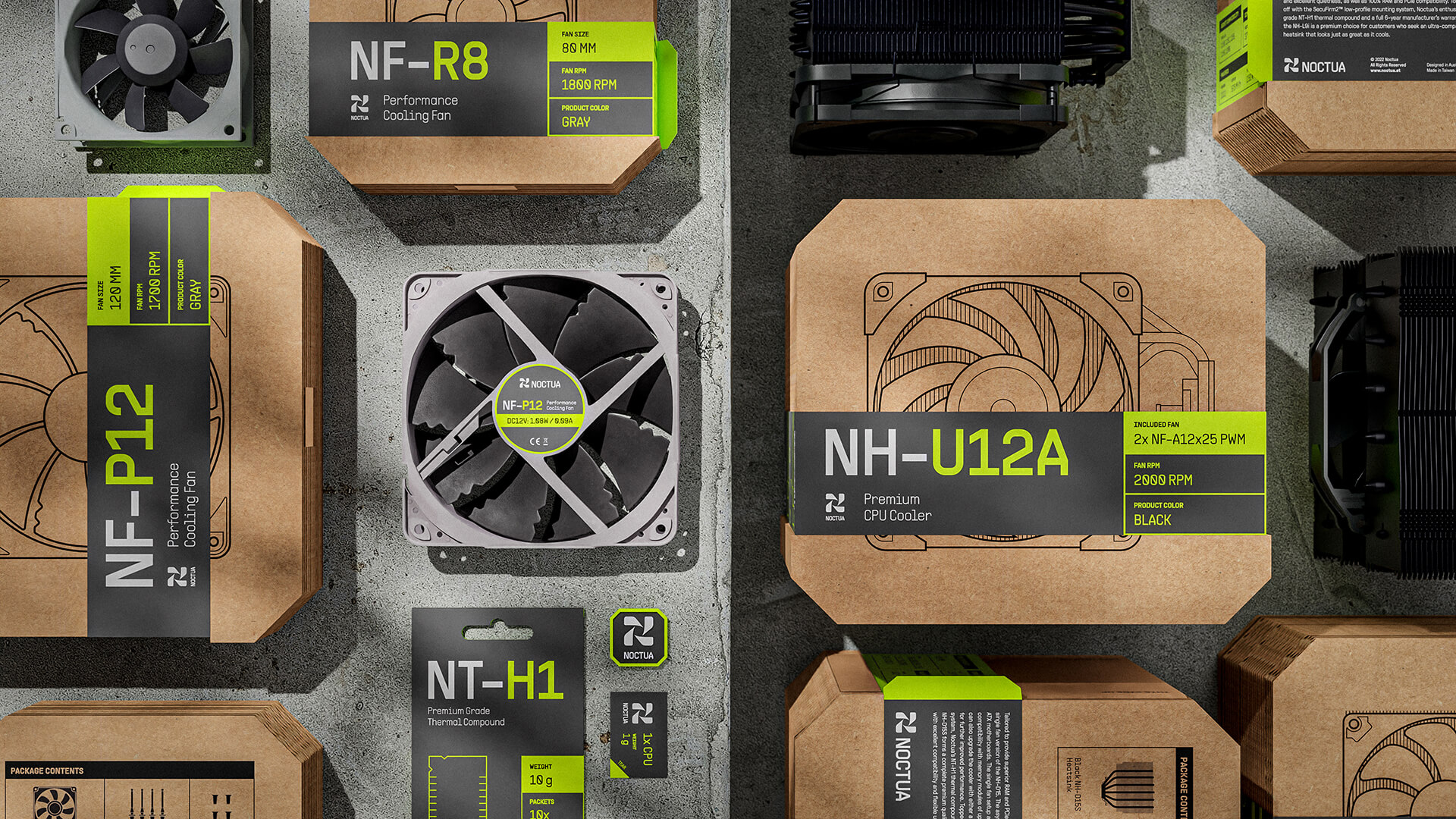
Complete packaging rebrand of Noctua, a manufacturer of computer fans for PC-building enthusiasts. The newly redesigned brand evolves the enthusiast market by embracing sustainability and technological innovation in packaging and communication. It also allows users to enjoy a more intuitive building experience through functional and efficient design.
→ Pentawards 2023 Silver
→ ADC Young Ones 2023 Shortlist
→ Pentawards 2023 Silver
→ ADC Young Ones 2023 Shortlist
Logomark
The logo mimics the circular forms of the fan and the letter N. Noctua's current brand equity of the owl is also kept throughout the color story.
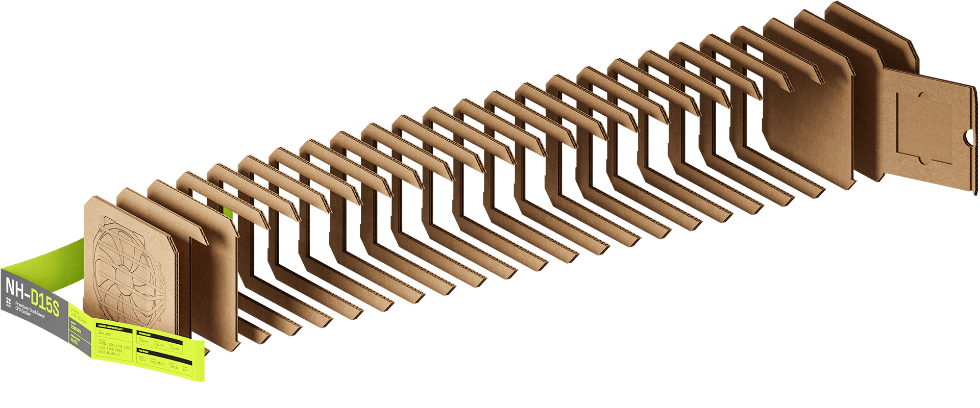
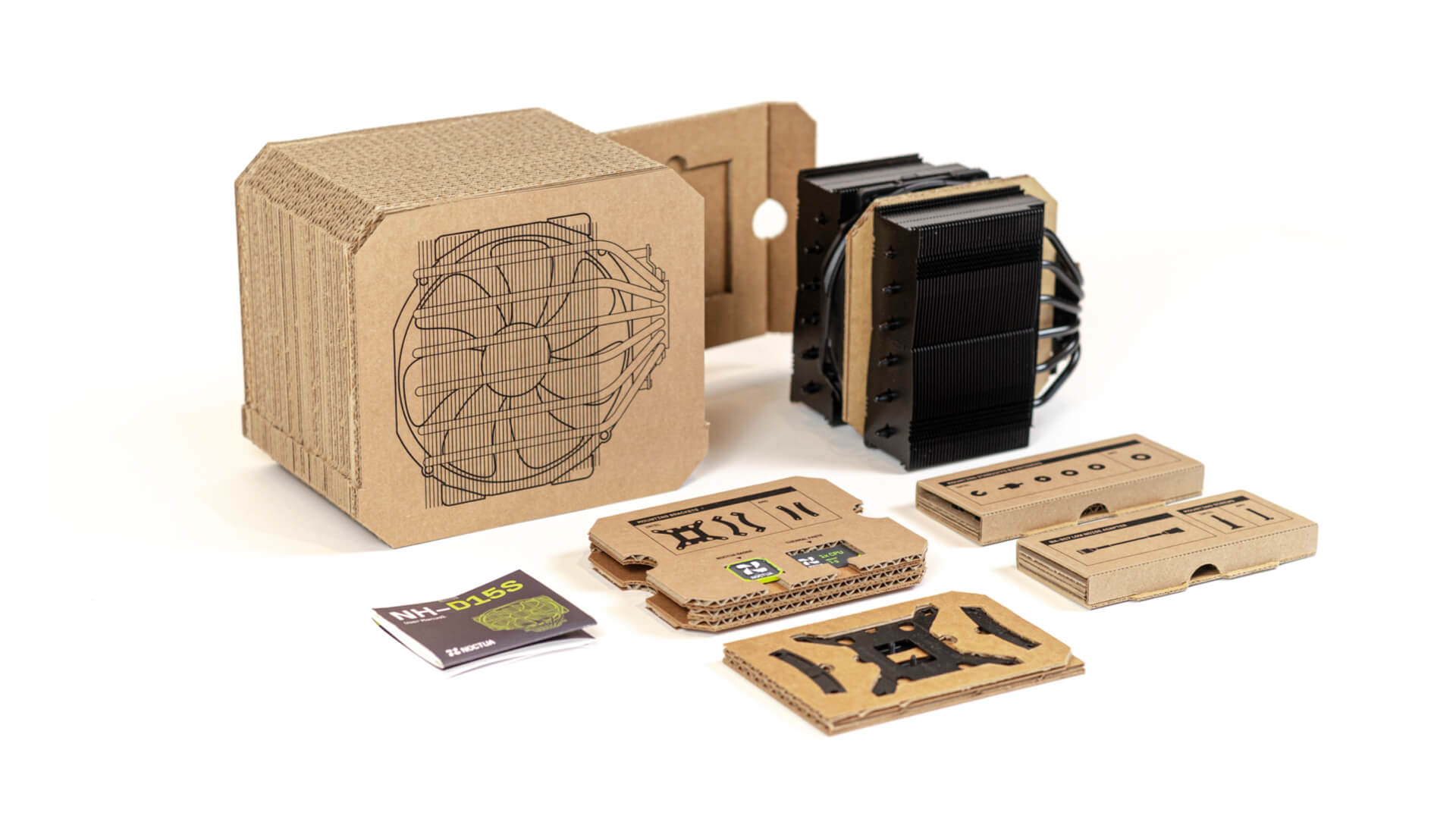
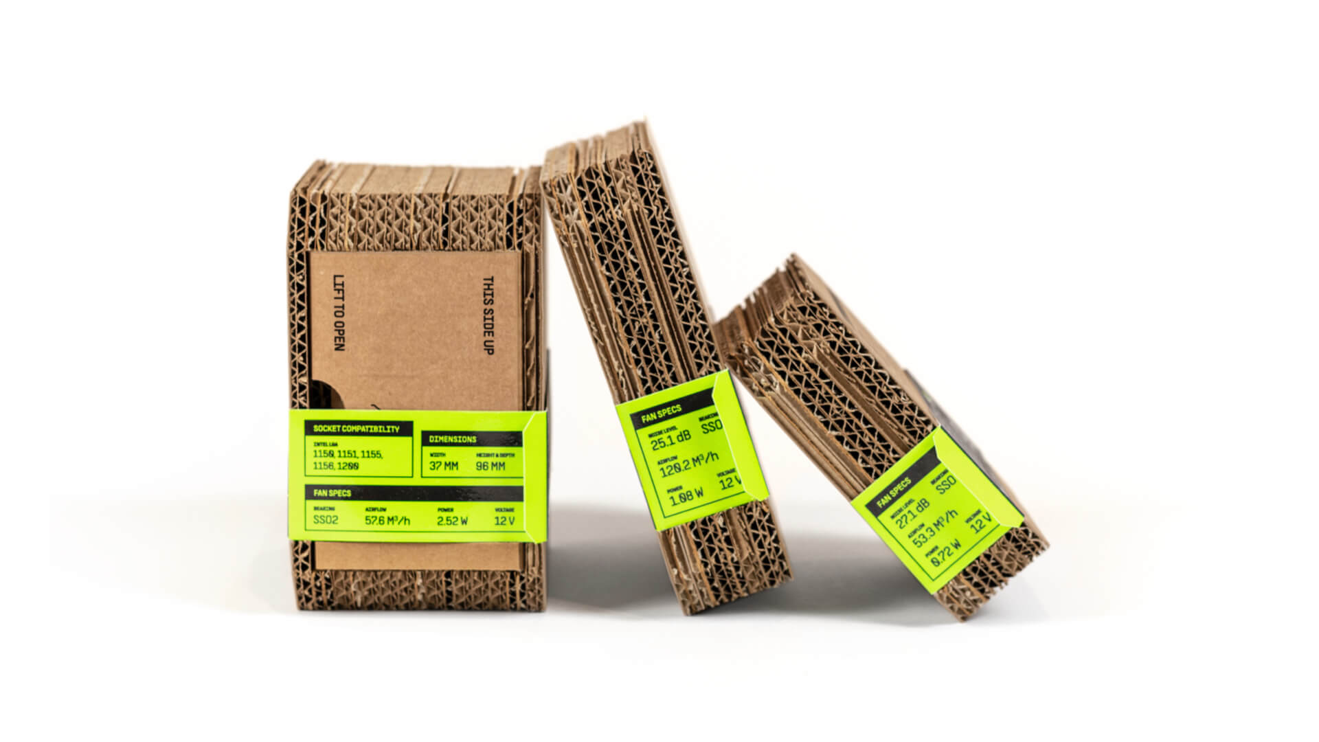
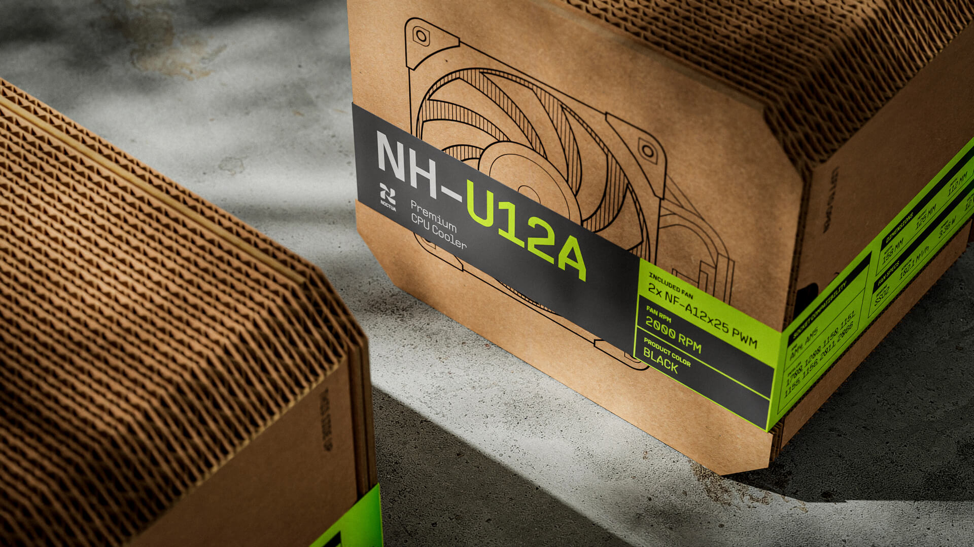
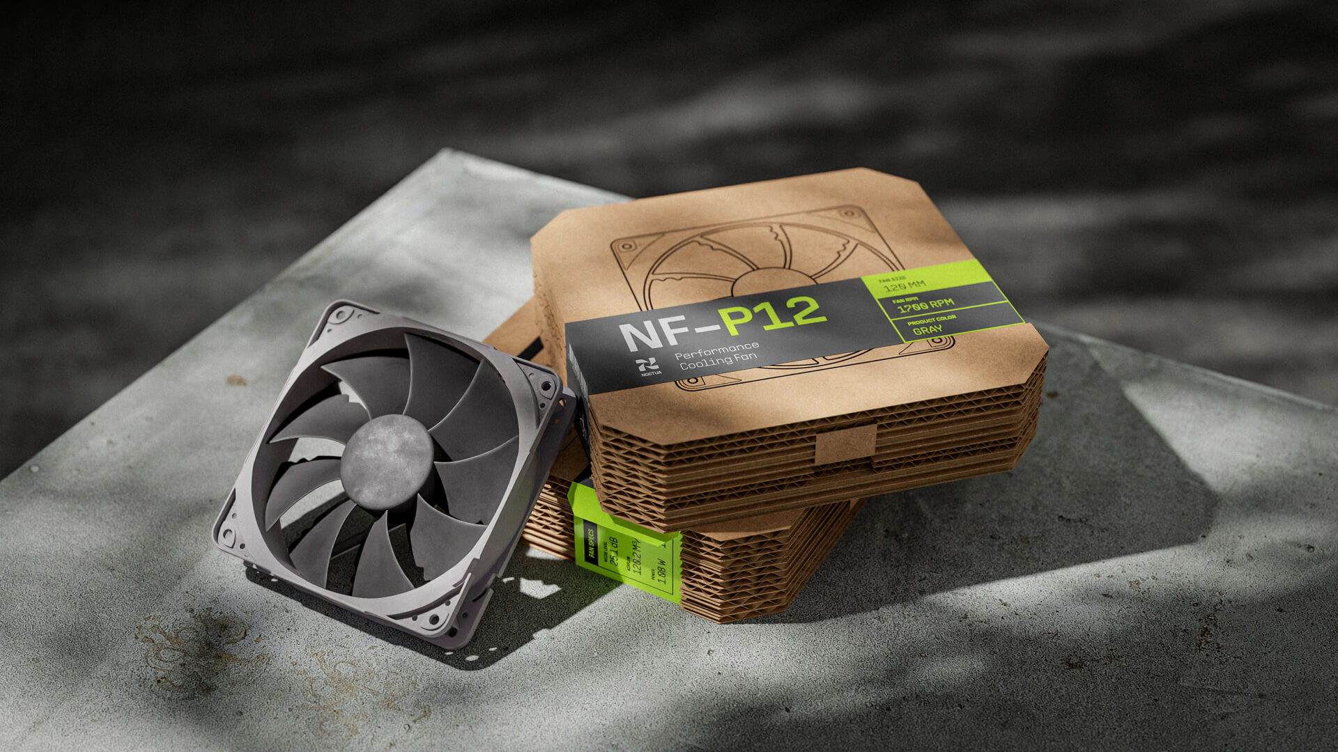
Packaging Concept
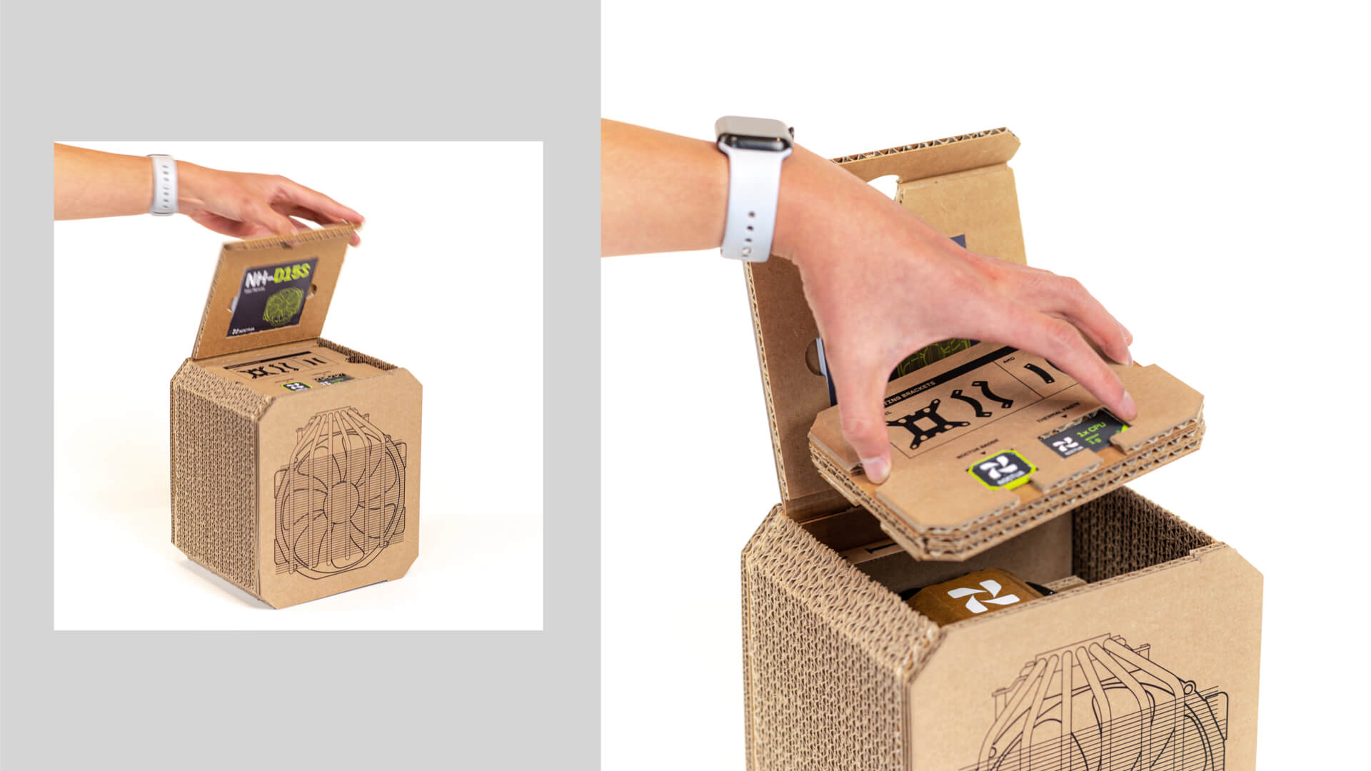
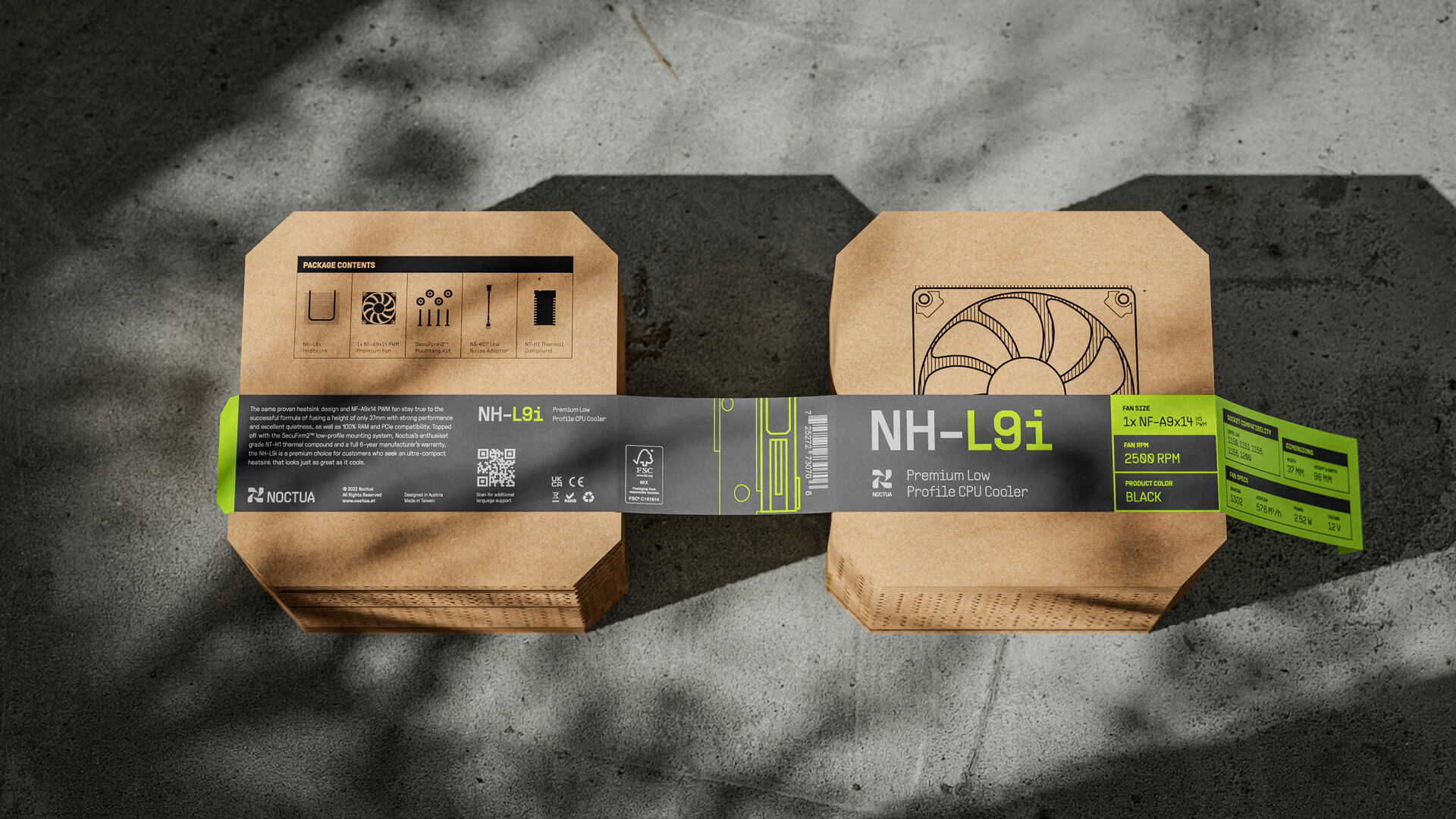
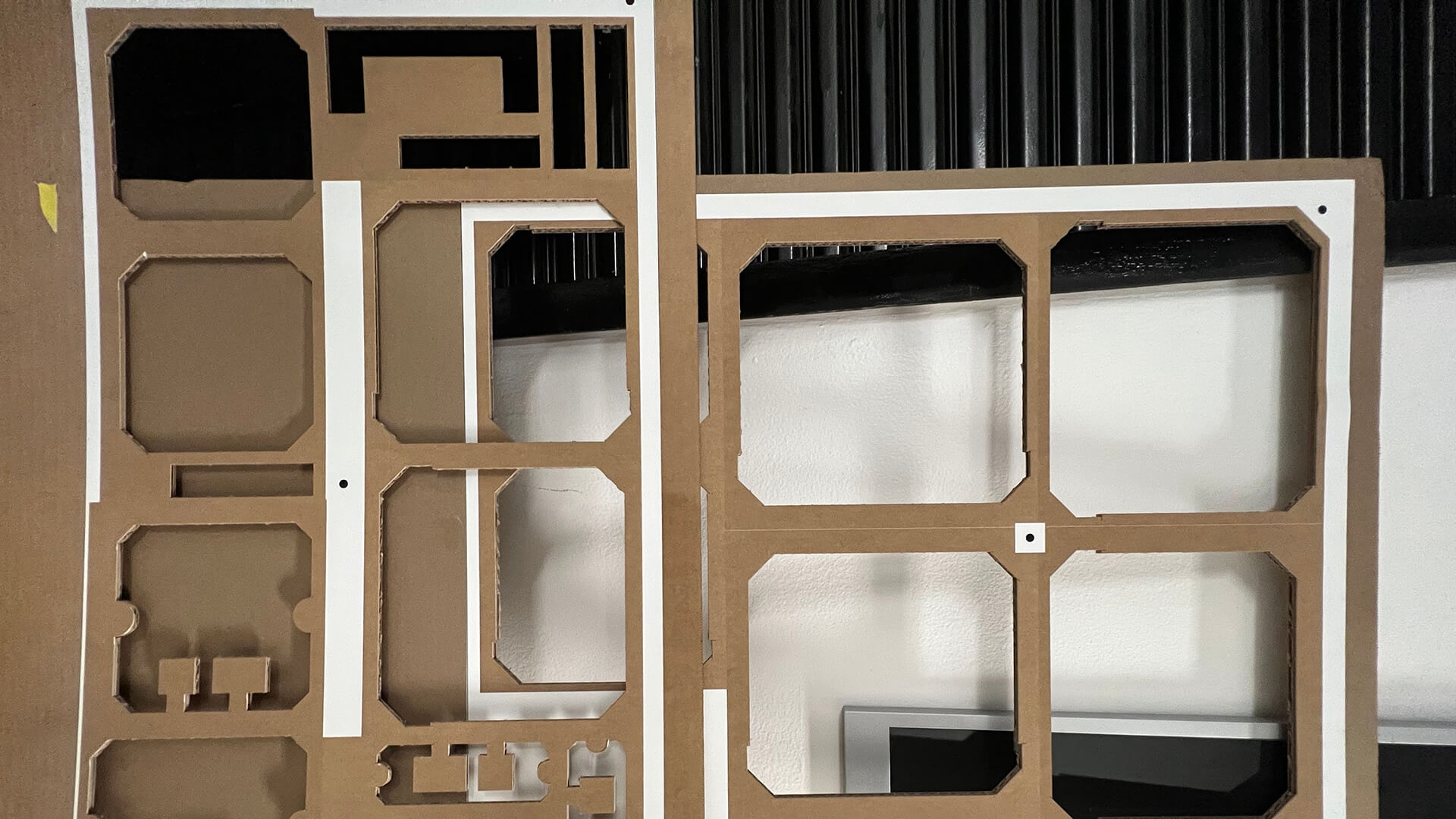
Cardboard stacking is used for both fitting and protection. Each layer can be designed in a unique shape to fit complex forms while being 100% compostable.
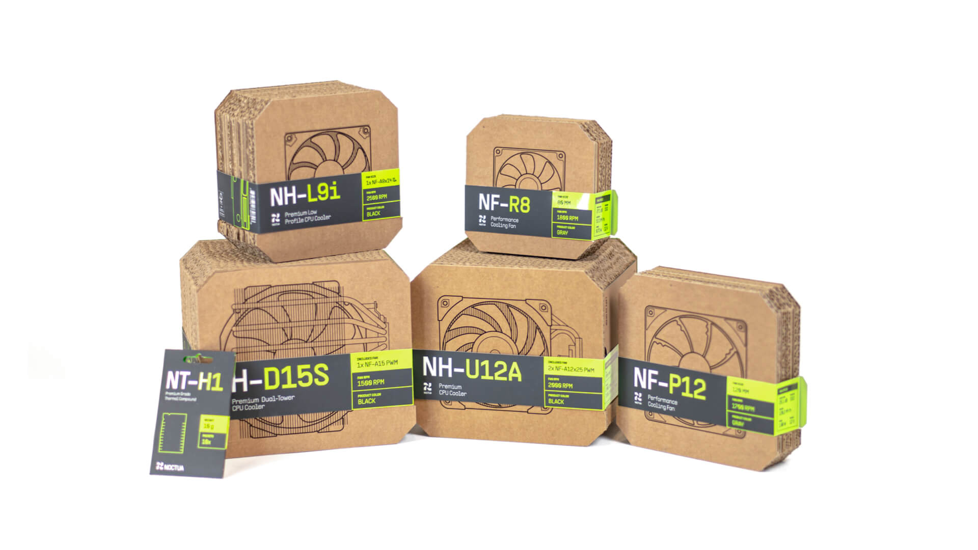
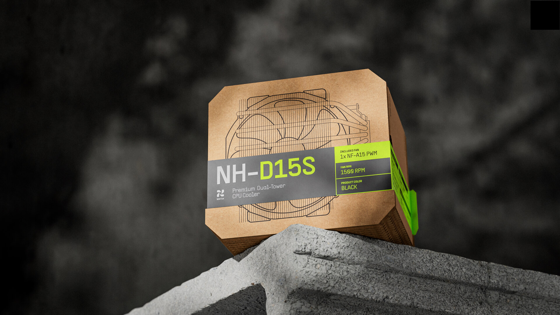
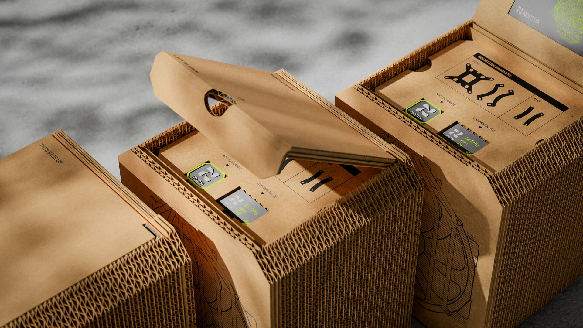
Packaging Lineup
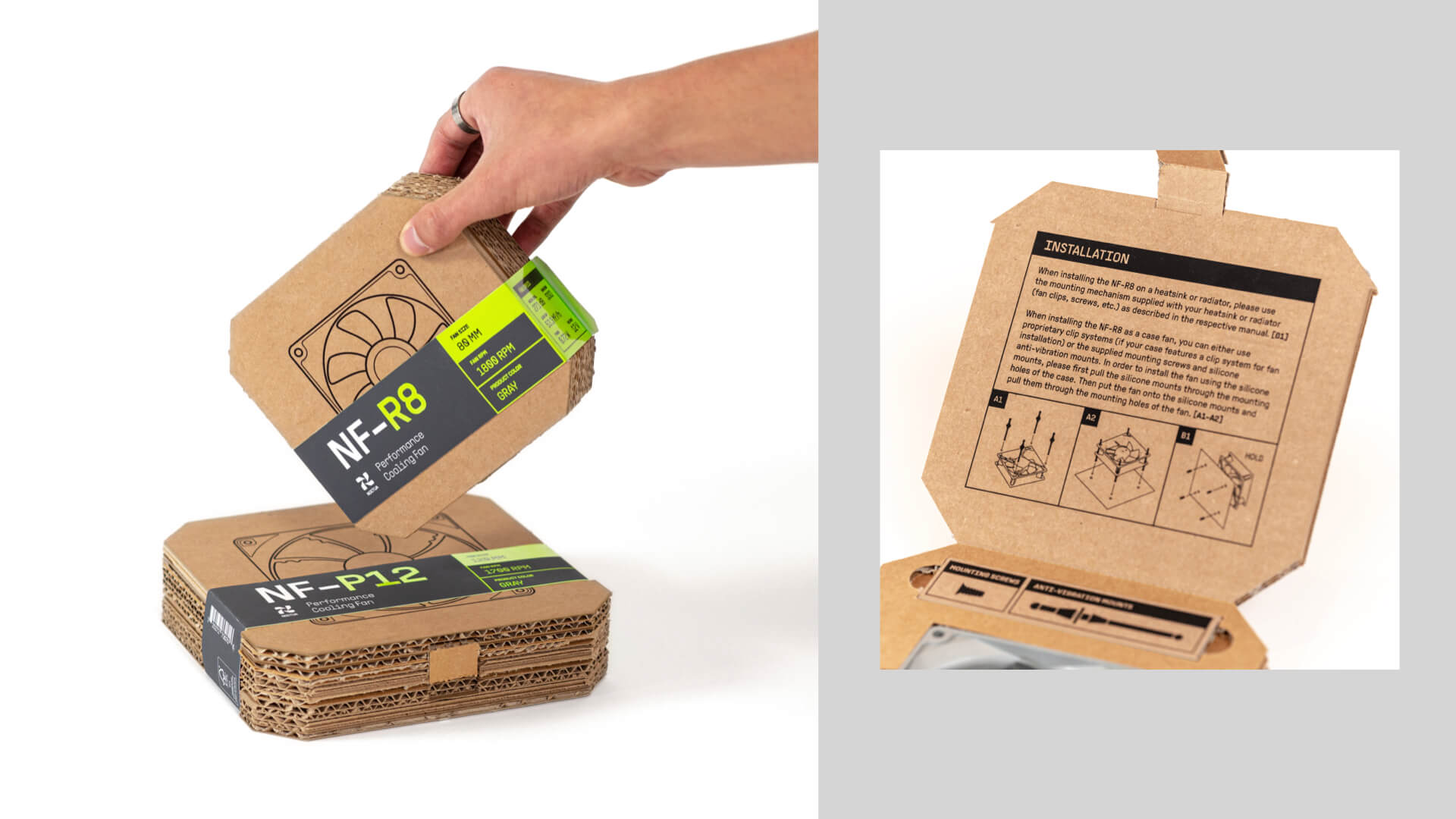
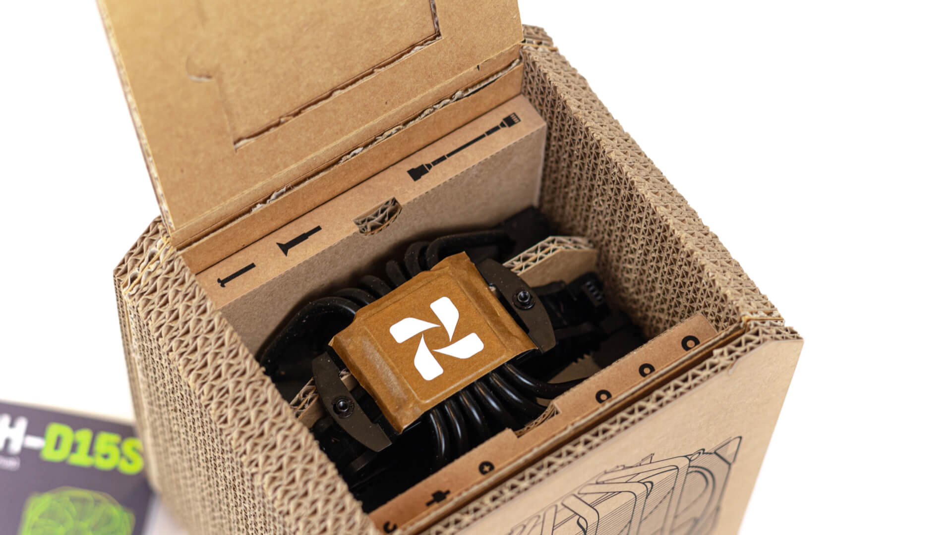
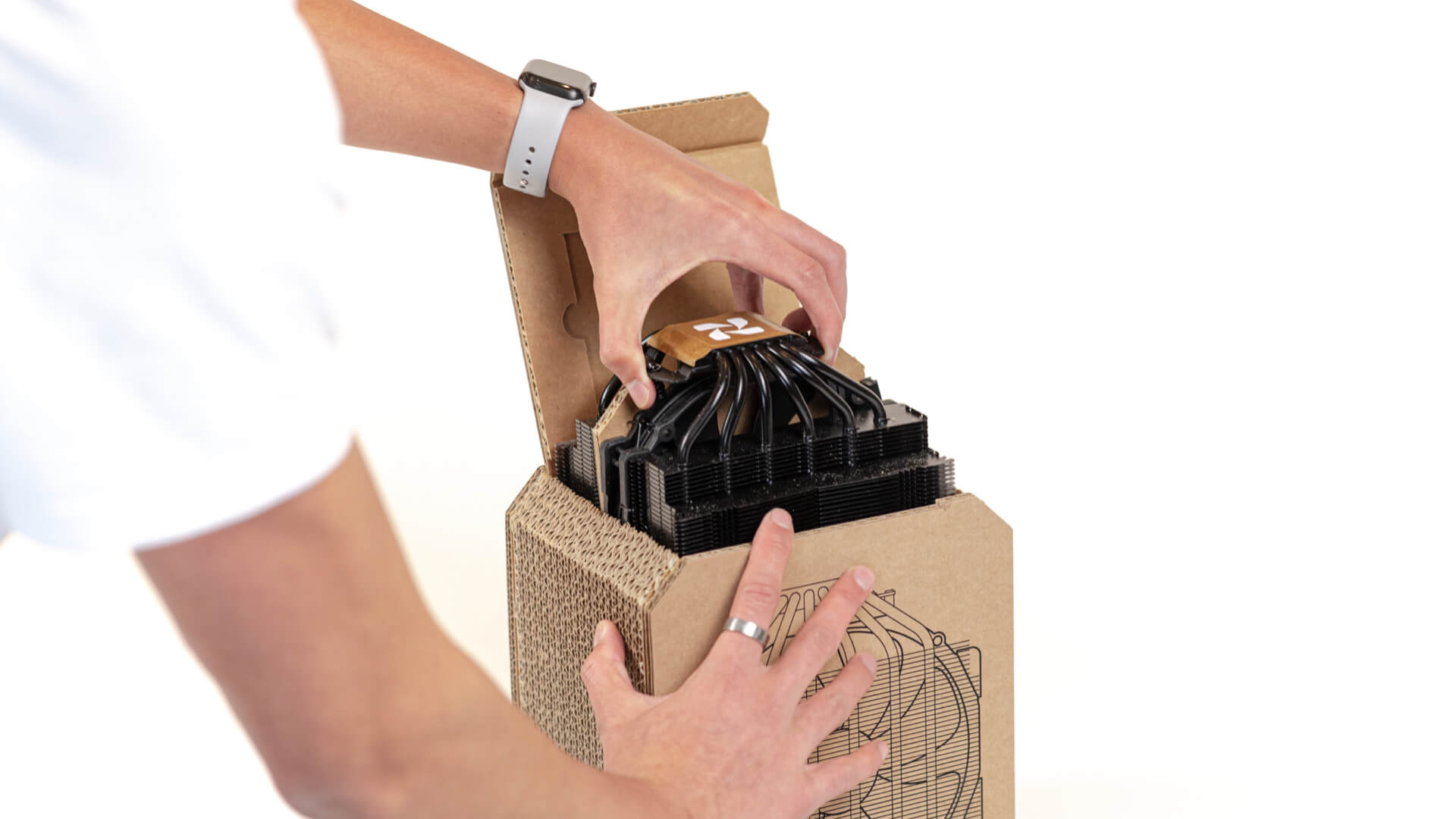
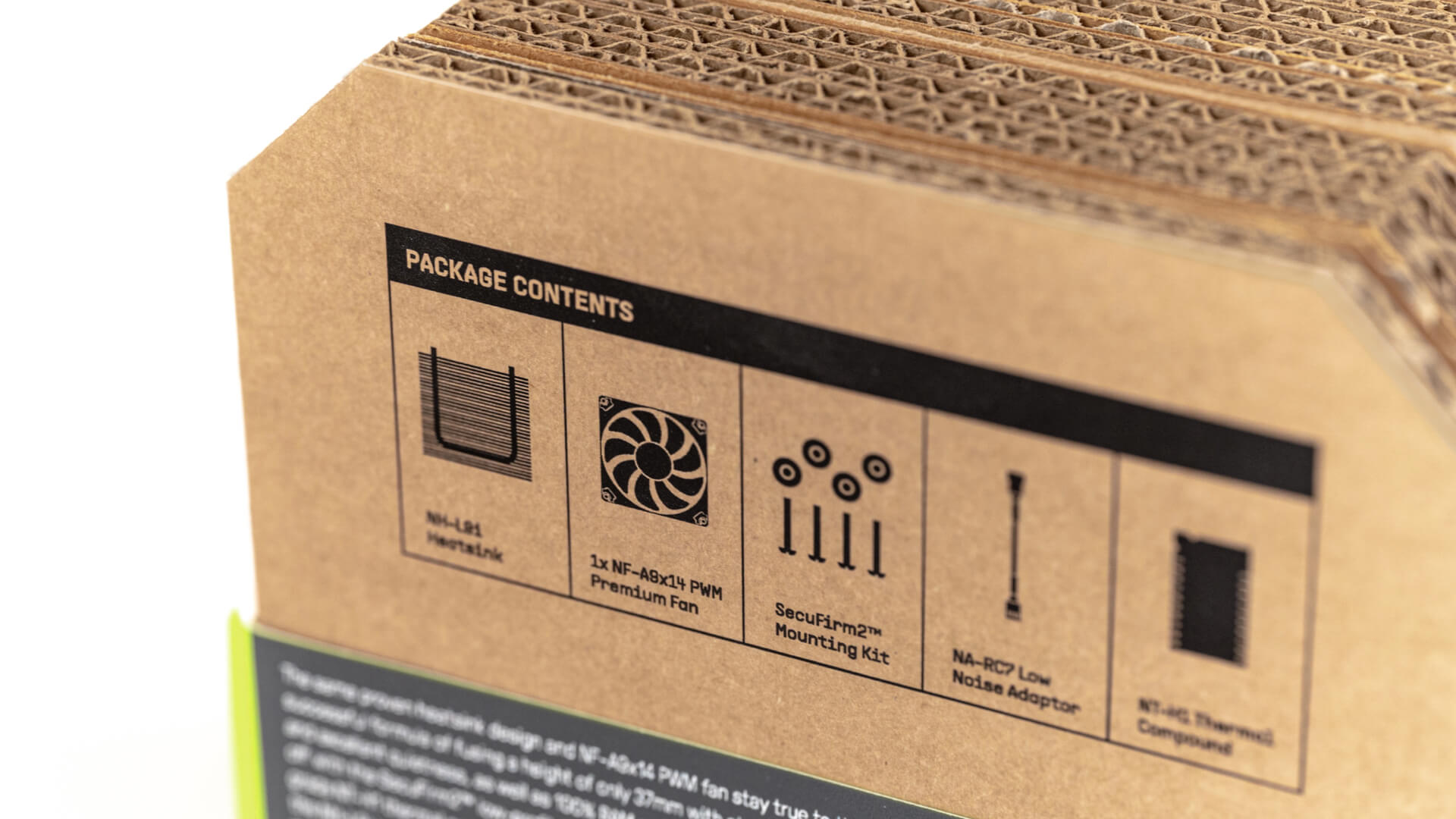
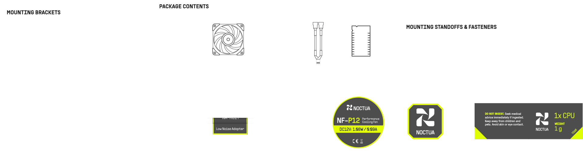
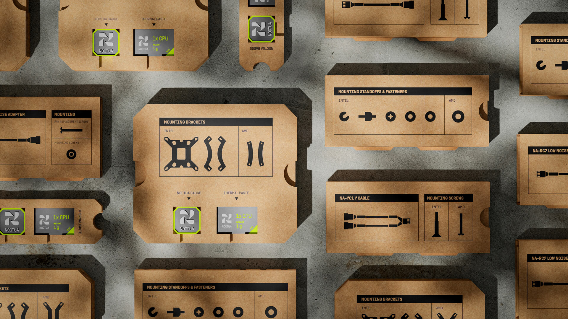
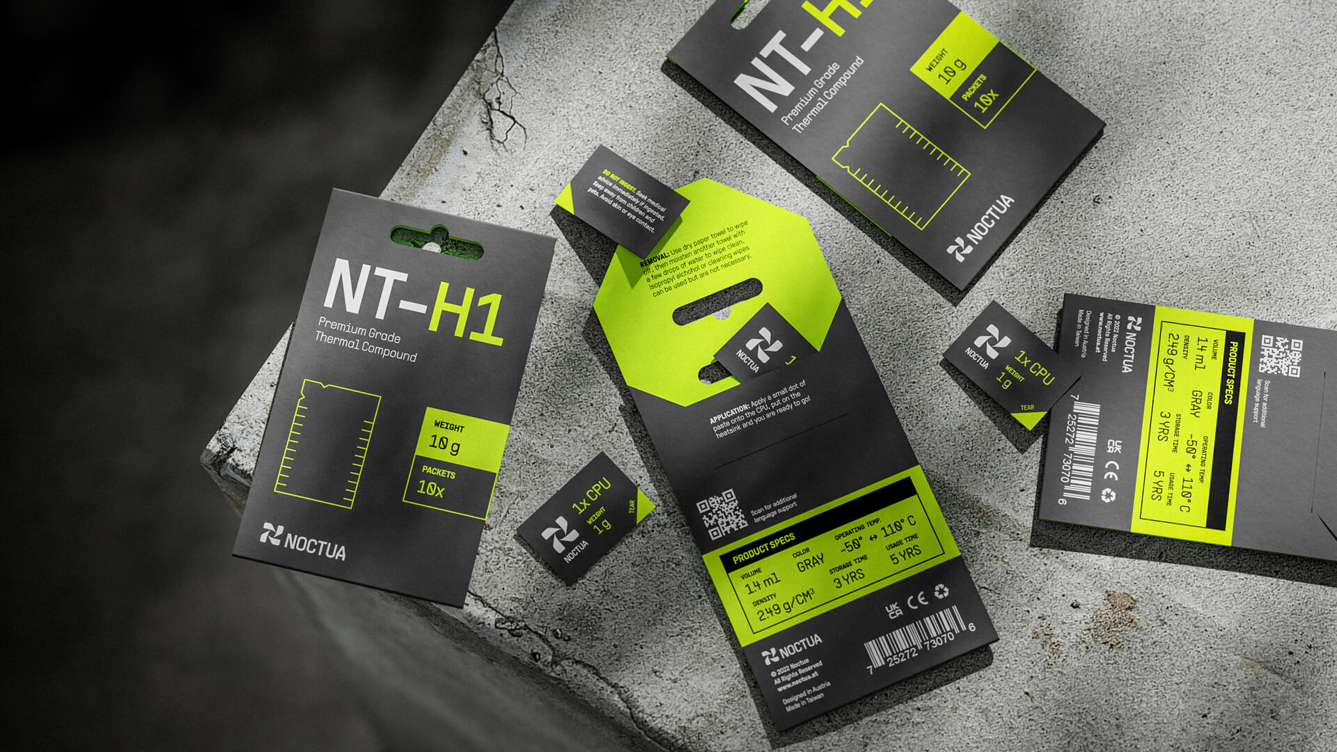
The simple lid design allows for convenience in the opening ceremony. The accessories come out one at a time, with the iconography labeled for identification.
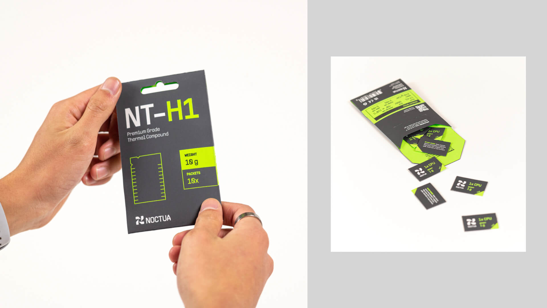
Instead of single-use plastic syringes, the thermal paste is redesigned in a paper envelope that holds the product in individual paper sachets.
Graphic Application
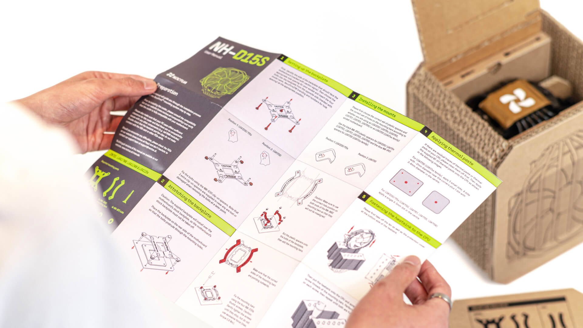
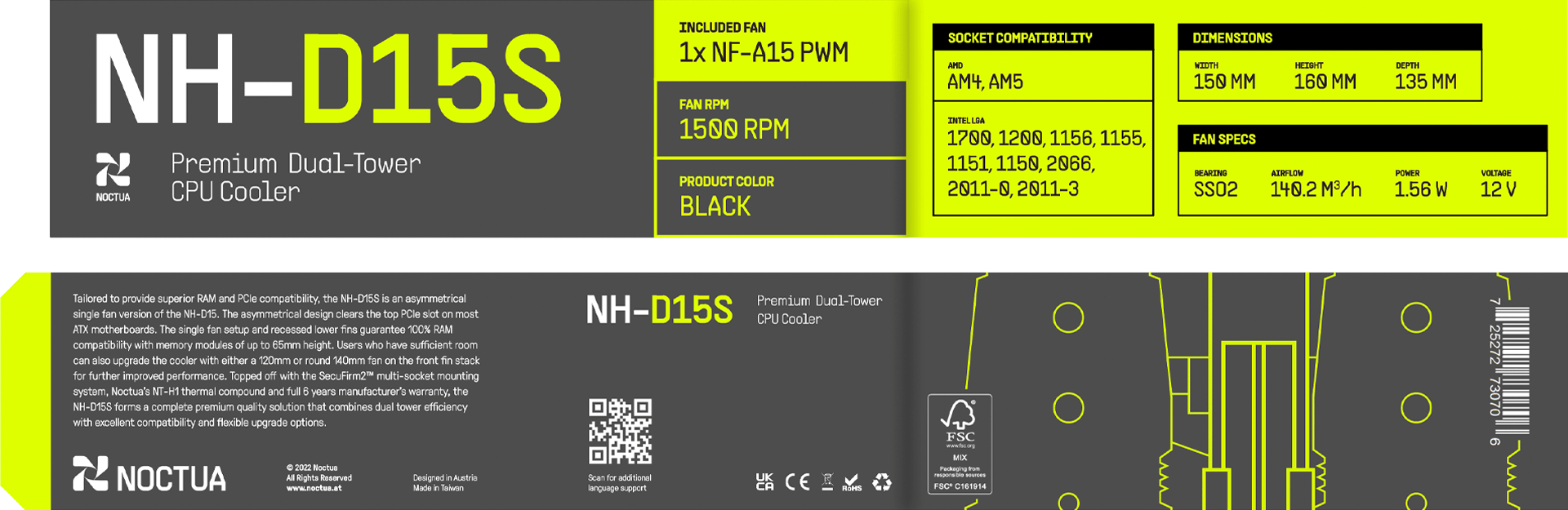
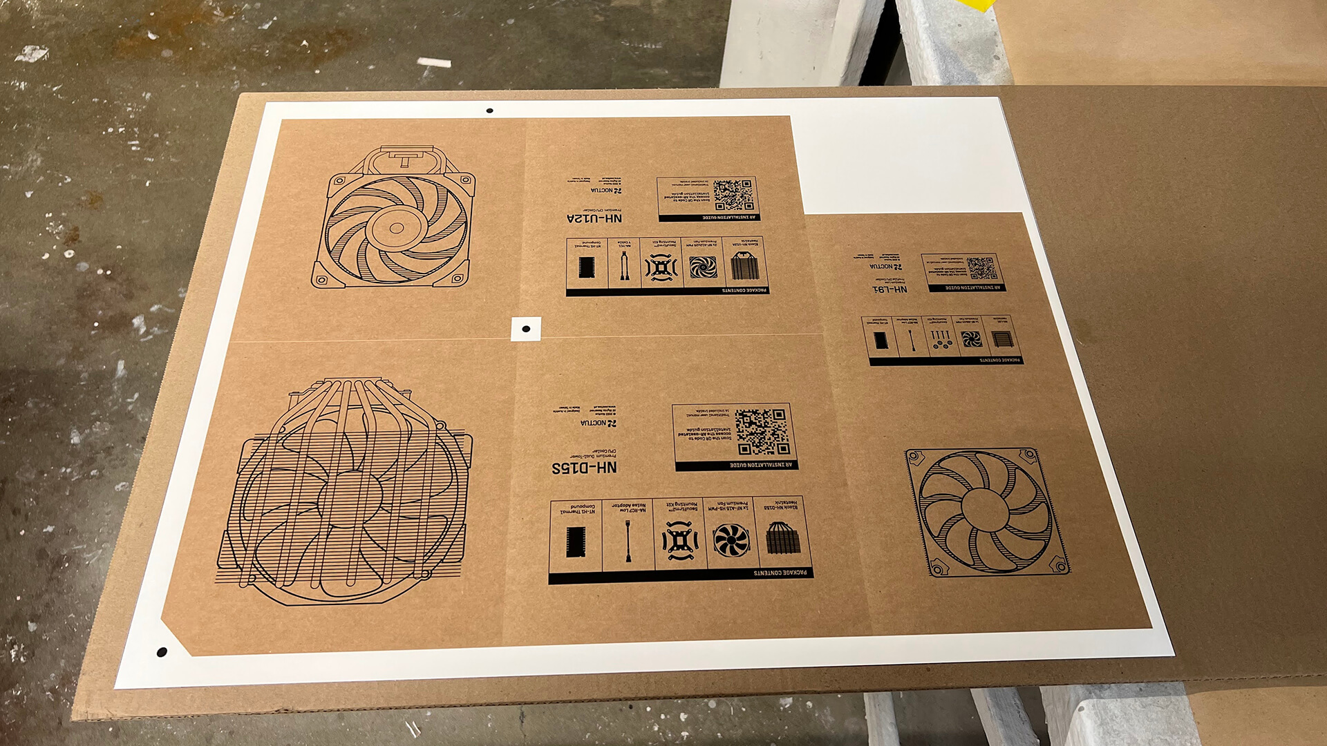
The redesigned label system makes it easier for the consumer to read. Technical information is contained into individual boxes that are paired with simplified illustrations.
Graphic Application
Retail Display
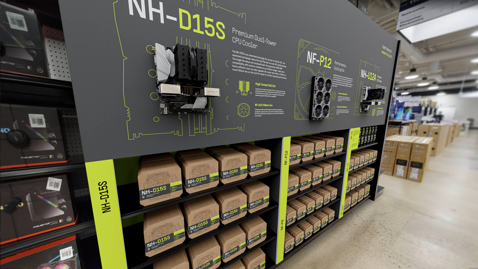
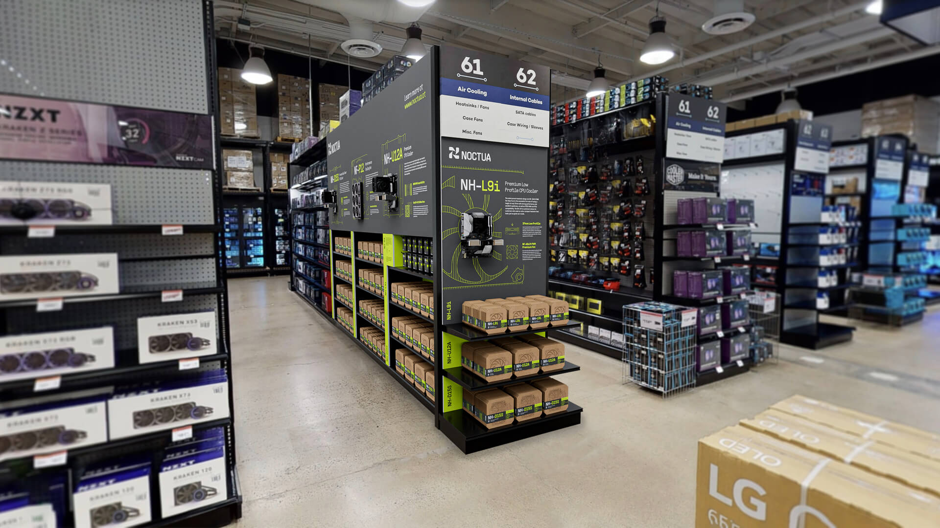
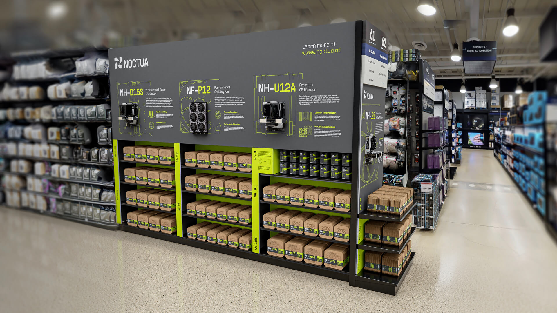
The retail space is redesigned with wall-mounted computers and graphics highlighting key features to help customers better understand the products.
Mobile App
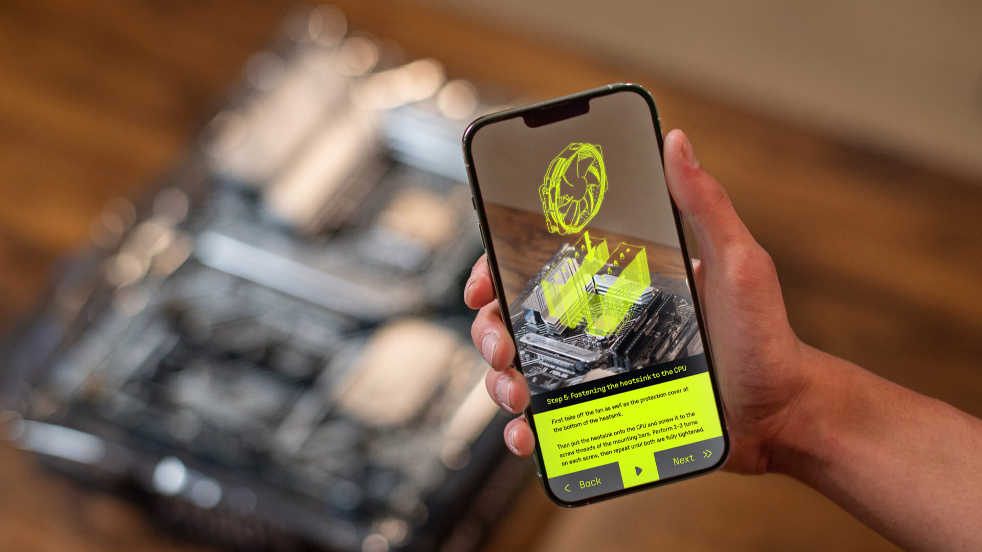
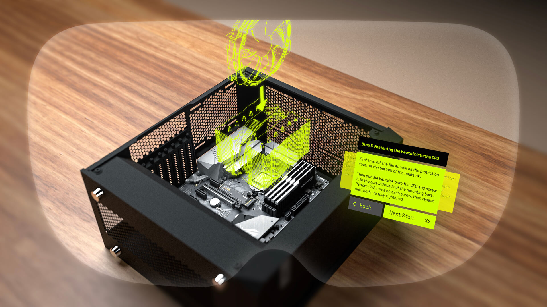
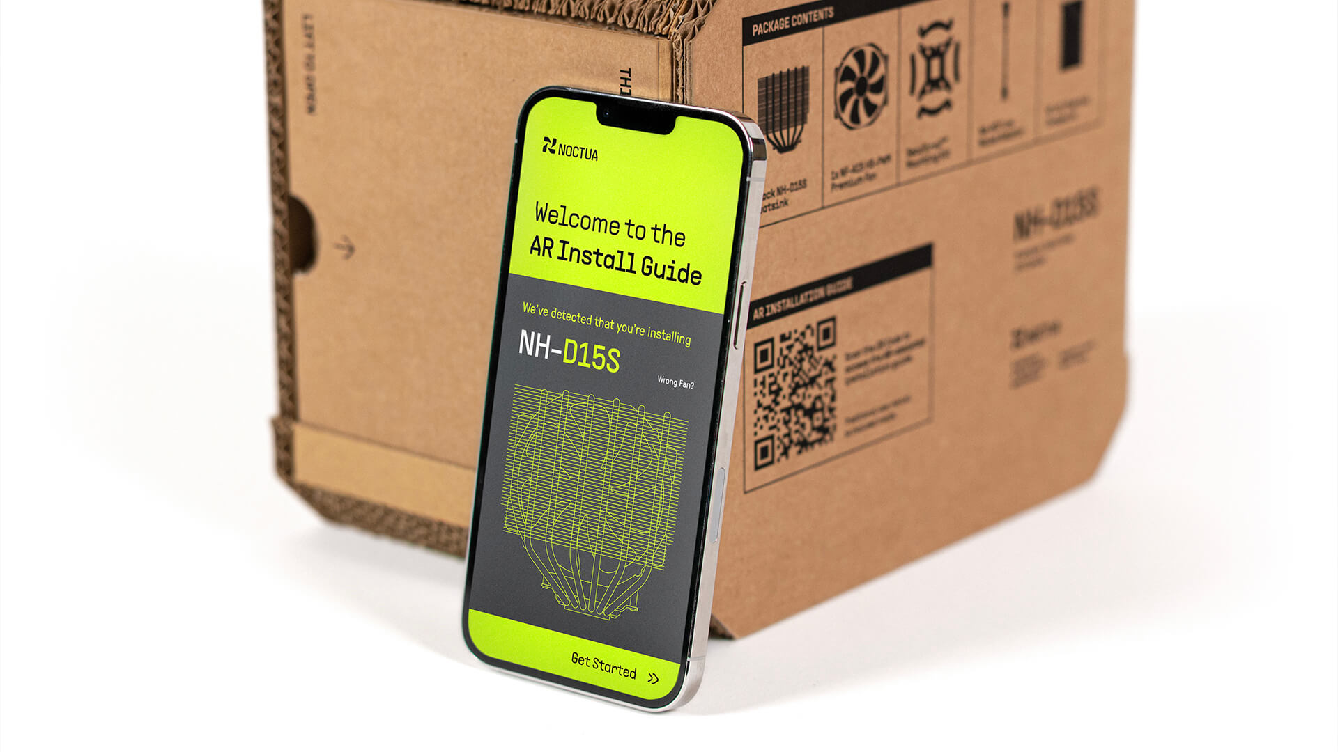
The app is designed as both an installation guide and a compatibility checklist. Product installation can be completed with an AR guide.
Mobile App
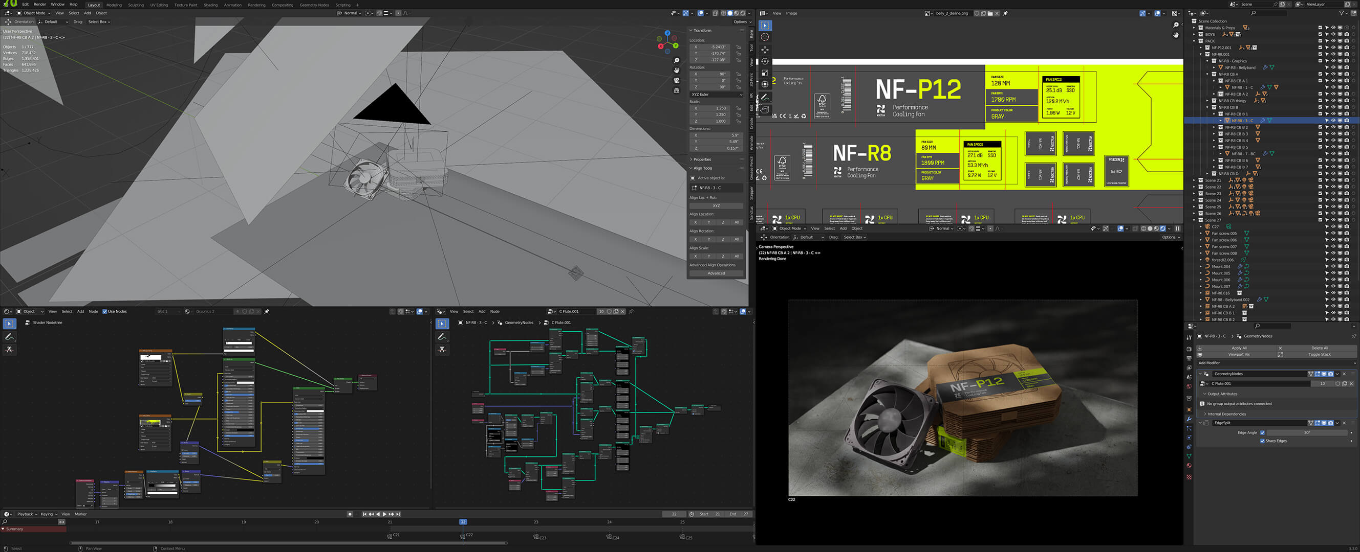
Geometry Nodes was used in Blender 3.3 to generate cardboard corrugation as mesh.
Special Thanks:
Gerardo Herrera, Paula Hansanugrum
Camera & 3D Printing - Jeffrey Su
Hand Model - Micah Hoang
Kongsberg Team - Craig, Leo, Megan, Dante
Custom Packaging Supply - Kevin Flanagan
Imperial Paper Co.
Gerardo Herrera, Paula Hansanugrum
Camera & 3D Printing - Jeffrey Su
Hand Model - Micah Hoang
Kongsberg Team - Craig, Leo, Megan, Dante
Custom Packaging Supply - Kevin Flanagan
Imperial Paper Co.
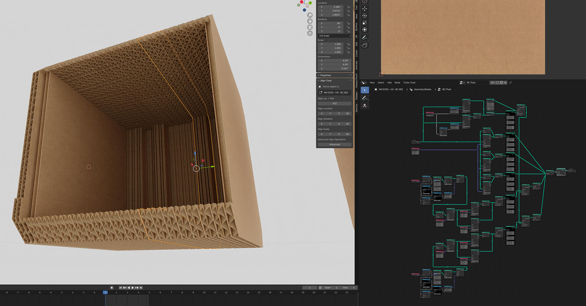
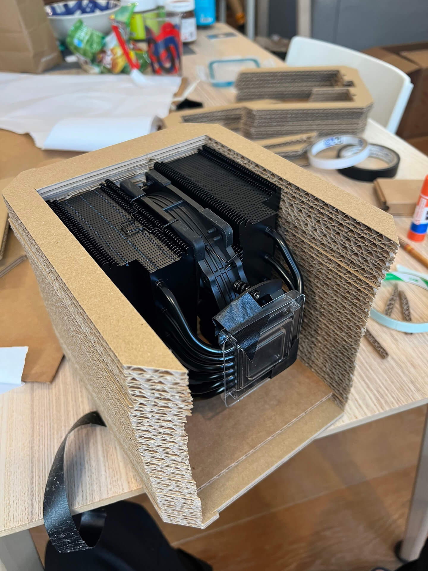
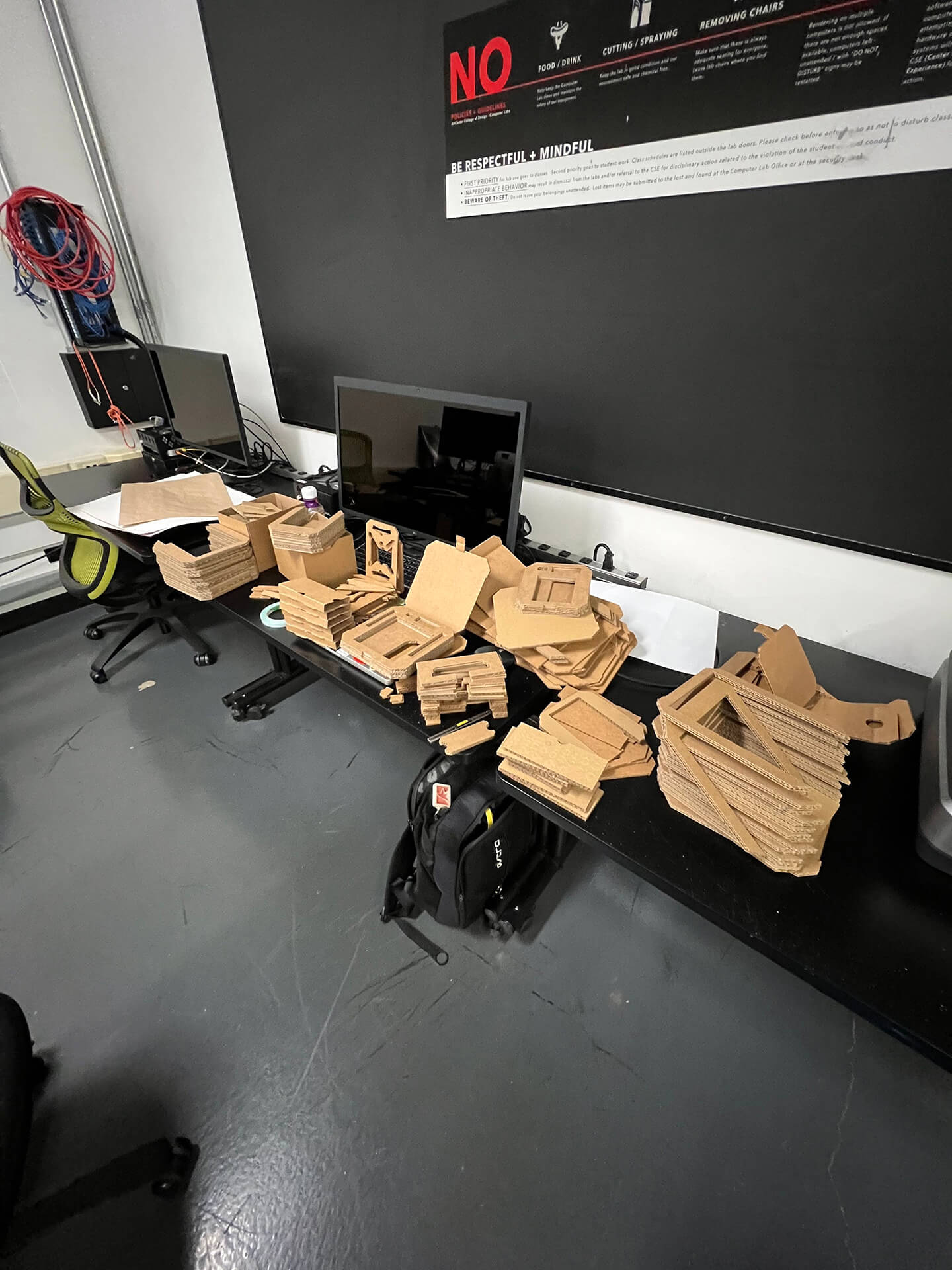
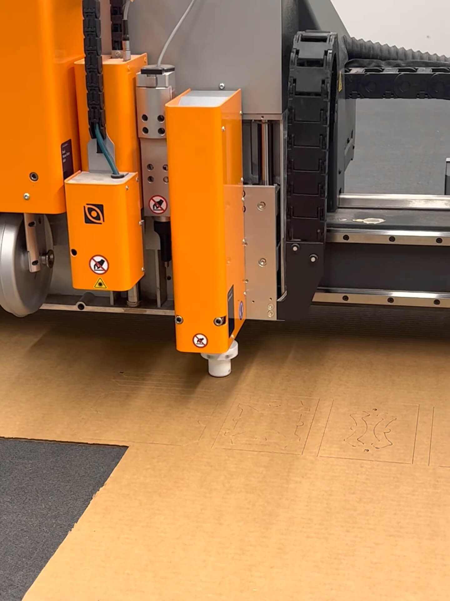
The cardboard stacking concept was achieved through precision cutting on the Kongsberg machine.
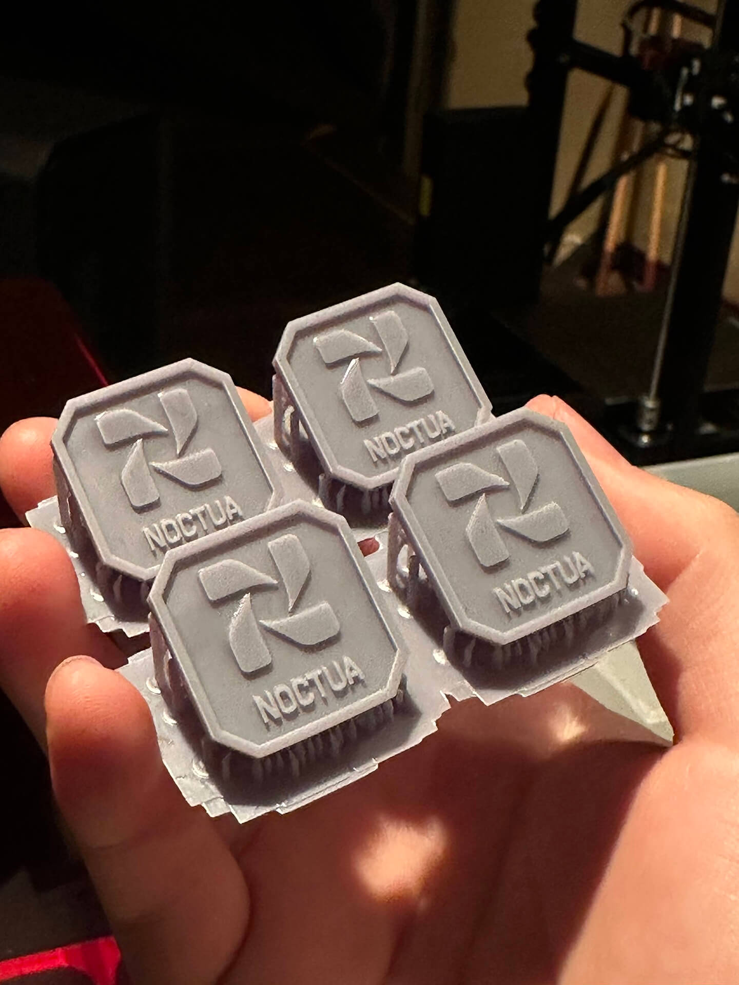
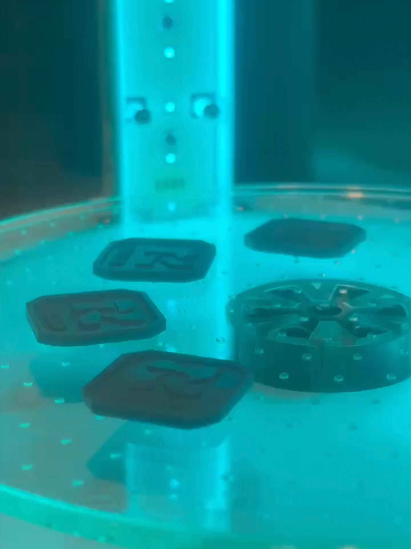
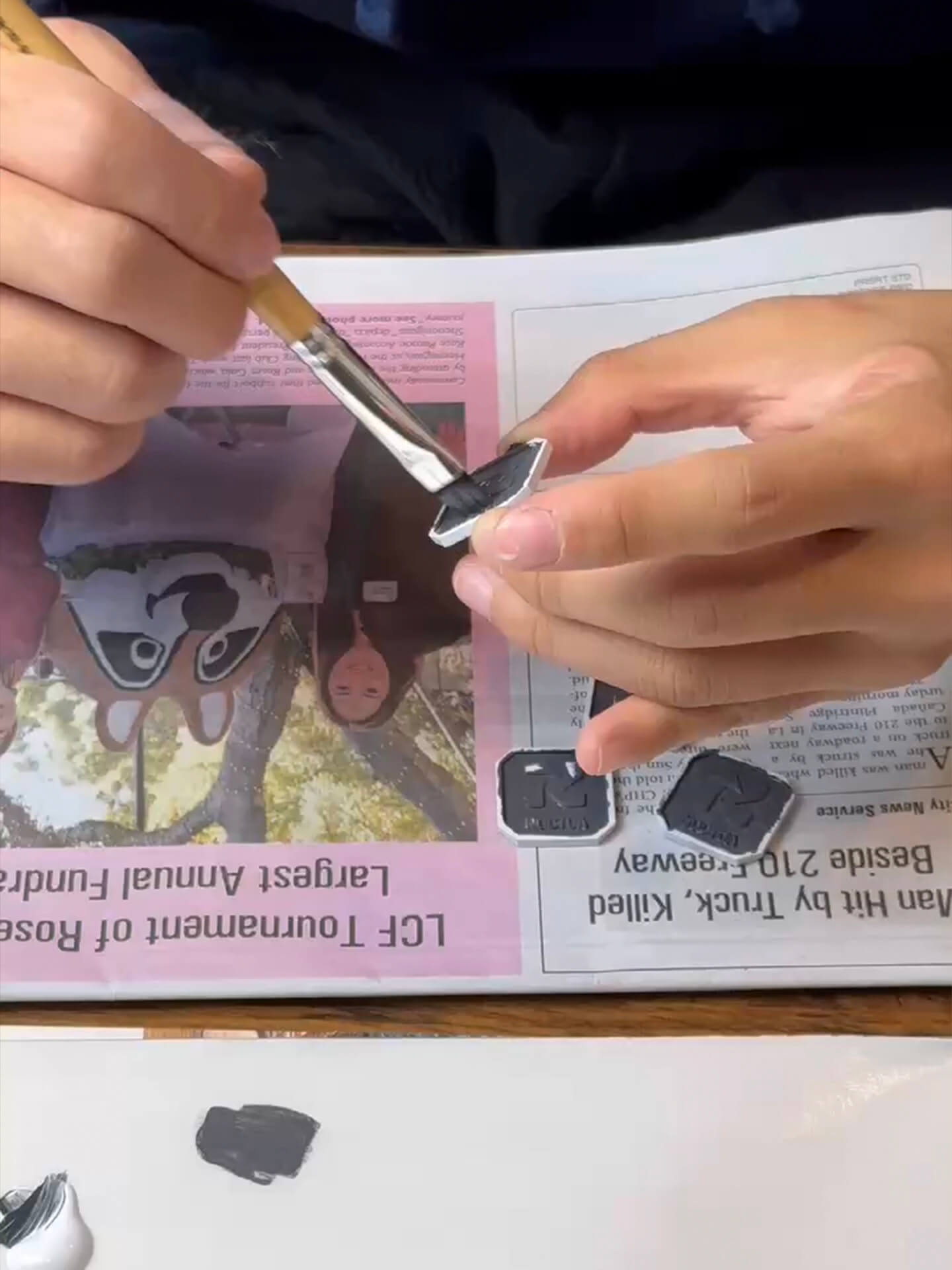
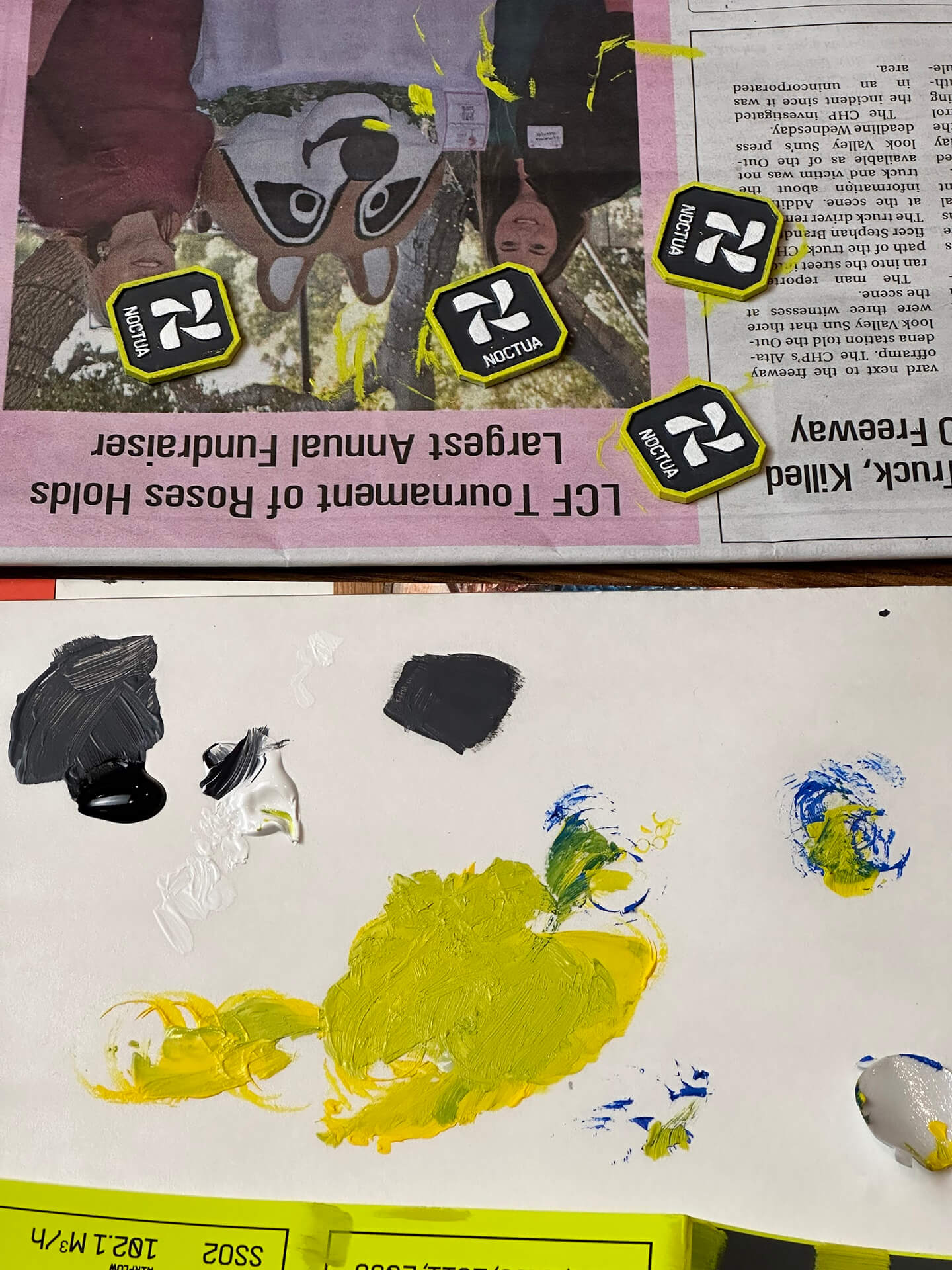
The souvenir badge was 3D-printed with resin and hand painted with acrylic gouache.
© 2026
hanson ma